
 Morning all. Today I am wearing very red lipstick as it’s grey and drizzly outside and I need cheering up – every little helps etc. (It’s not a Tesco lipstick, its Lancôme, although I did hear that Marks and Spencer’s makeup is made by Chanel, so there you go). Luckily the weather this weekend, as you probably know, was blazingly glorious and my lipstick wasn’t required to brighten up any cultural pursuing. Phew. I actually wasn’t quite sure if I would have time to fit in a pursuit at all this weekend as I spent most of it out of London. However, I managed to do a quick gallery search using my very useful Timeout iPhone app on the train on the way back in and came across a fabulous newly opened space which I am now uber uber excited about, namely because it was high Victoriana and FREE!! None of this bullshit £15 crap for a mediocre exhibition which would just put me into a bad mood before I even got in:
Two Temple Place, formally known as the Astor House, only opened last month and rather brilliantly is now going to be a space to show off a variety of publicly owned art from regional collections around the UK. This is very exciting for me as it is somewhat connected to aspects of my job, and here I am going to encourage you once again to look at the BBC Your Paintings website which showcases all of the oil paintings in public collections across the whole UK. (They are about to have 100,000 on there but will be more added over the next year): http://www.bbc.co.uk/arts/yourpaintings/. It’s honestly a really great site and well worth checking out, I’m not just saying that because I was involved in aspects of it!
Their first exhibition is William Morris: Story, Memory, Myth, which I will go into detail about in a minute – first we need to talk about this building. MY GOD, this place is cool. I mean cool if you like high high Victorian Gothic, which admittedly may not be to everyone’s tastes (fools) but is basically my idea of pure architectural heaven: Astor House, as it was formally known, was built by the great American tycoon William Waldorf Astor as his London offices. He was later known as Lord Astor, the granting of his peerage reputedly causing much scandal as he essentially bought it through massive amounts of right-on Victoriana philanthropy, benefitting amongst many many others something called the Women's Memorial to Queen Victoria. Bet they were a bunch of laughs. His son was the great newspaper mogul of the next generation having been gifted various publications as birthday presents over the years along with entire recreation Tudor Villages. Anyway this guy was known as the richest man in America and also the landlord of New York because he owned most of it and was also, obviously, famed for such enterprises as the Waldorf hotel. His family had made their money in fur trading but, and here I must quote the rather vague Wikipedia article re his relocation because it made me piss myself laughing;
‘In response to a family feud which developed with his aunt […] in 1891 over matters of standing in high society, Astor moved to Great Britain with his family’.
How great is that?? Matters of standing in High Society?? One can only imagine… all very Edith Wharton nay? Anyway clearly in a big old piss he spent a few years travelling round Europe working in various diplomatic and governmental roles including a few years spent in Italy where he reportedly developed his passion for art and collecting. When he eventually settled in England, buying such stately piles as Hever castle, home to Anne Boleyn, he set about building the ultimate Victorian town house and with seemingly unlimited sources of capital and enthusiasm he engaged some of the most celebrated architects and craftsman of the day. Clever old William.
‘In response to a family feud which developed with his aunt […] in 1891 over matters of standing in high society, Astor moved to Great Britain with his family’.
How great is that?? Matters of standing in High Society?? One can only imagine… all very Edith Wharton nay? Anyway clearly in a big old piss he spent a few years travelling round Europe working in various diplomatic and governmental roles including a few years spent in Italy where he reportedly developed his passion for art and collecting. When he eventually settled in England, buying such stately piles as Hever castle, home to Anne Boleyn, he set about building the ultimate Victorian town house and with seemingly unlimited sources of capital and enthusiasm he engaged some of the most celebrated architects and craftsman of the day. Clever old William.
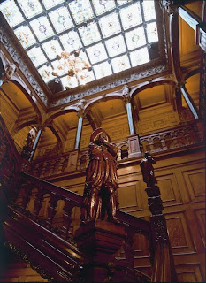

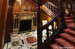
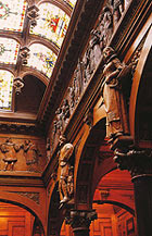 He hired the celebrated Gothic Revival architect John Loughborough Pearson who was something of a star at this point (the house was completed in 1895) and also the various skills of craftsman such as the sculptors William Silver Frith, George Frampton and Nathaniel Hitch. Basically elaborate is not the word – every element of this building, interior, exterior and roof, is covered in some sort of decoration. The exterior is made of Portman stone and covered in fabulous carvings. The portico is designed by Frith and much is made of the iron statues on either side showing small cherubian like boys representing the new exciting age of telecommunications. Inside there is the most incredibly ornate mahogany staircase carved by Thomas Nicholls which depicts characters from Astors favorite novel The Three Musketeers (good choice). Around the top of the stairs is a finely carved frieze depicting eighty-two characters from Shakespeare’s Othello, Henry VIII, Anthony & Cleopatra and Macbeth. Around the hall are carved ebony statues, again by Nichols, showing favorite figures from American literature such as characters from The Last of the Mohicans, The Scarlet Letter and Rip Van Winkle. In other rooms of the house there is even more intricate carving by Frampton including panels (which were exhibited at the Royal Academy) depicting 9 heroines of the Arthurian Legends. How amazingly Victoriana is all this? This guy clearly loved pot boiler style historical literature, something the 19th century did oh so well, so he decides to have his entire house covered in his favorite characters from them – I mean there are even characters from Ivanhoe – the ultimate Victorian Historical novel! Basically this guy was the ultimate Victorian client – he wanted the whole world under one roof and he didn’t give a fuck about money, taste, period, public opinion – anything!! I LOVE him.
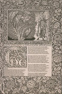 This incredible mishmash of historical and literary sources and architectural styles has to be the most brilliant place to stage an exhibition of William Morris. As the intro on the gallery website states: ‘The inaugural exhibition looks at how William Morris told stories through pattern and poetry. It will examine the tales that were most important to him, such as the works of Geoffrey Chaucer, Norse saga, Arthurian legend and Greek myth.’ So pretty perfect space for it then. I thought this could all be summed up well by some text at the very beginning of the show quoting Ford Madox Brown. I paraphrase massively here as can’t remember what he exactly said but it was something along the lines of Morris’s inspiration being unchanging; the things that interested him as a child continued to inspire him throughout his life, the stories and myths of childhood serving him right up to death. Which seems to be the same for Astor who’s childhood literary loves clearly stayed with him in an extremely palpable way throughout maturity and old age. Sums up a large amount of the 19th century really – it was an era of childhood nostalgia in the face of blinding modernity and very serious adult concerns. They were basically a race of overgrown teenage girls. Which is why I love them.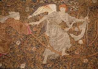
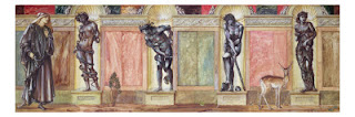 The first room of the show dealt mainly with Morris’s collaborative tapestry and embroidery work with Burne-Jones – my favorite Pre-Raphaelite. Yay! Together they were obsessed with the work of Chaucer, as everyone pretty much was at this time. They illustrated books of his work and there was a very fine example of Burne-Jones stained glass depicting some of the major characters. I’ve never actually read any Chaucer so can’t really comment a huge amount on this. This room also contained some beautiful but rather weird tapestries that illustrated a text both Morris and Burne-Jones found huge inspiration from called Roman de la Rose (Romance of the Rose). This was a medieval French text that was believed to have been translated by Chaucer himself which is probably how Morris and Burne-Jones became familiar with it. What immediately struck me about the work inspired by this tale was there undeniable similarities to the work Burne-Jones made around the sleeping beauty story or as he called it the Briar Rose and in fact I believe the tapestries and works in this series were often subtitled Briar Rose. Here, like in the sleeping beauty series, a tangle of suffocating rose brambles seems to encase and imprison the medieval style figures set within. It is used as an intense decorative background pattern but also communicates a sense of timelessness and imprisonment. The story is an allegory of the medieval ideals of courtly love (I think I am going to start trying this – it’s basically like an extreme version of The Rules) where some guy stumbles across a secret heavenly style garden and glimpses a bed of roses in some fountain of love and sets about to try and pick them, or conquer love, with various allegories of love and the vices helping and hindering him along the way. Various tapestries were designed and made for various country house commissions but unfortunately they seem to have faded quite a lot. The three or four on show here are still impressive in terms of the texture and density of the embroidery which gives a kind of focus-less pattern like quality to the pieces.
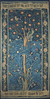
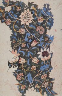 Above the stairs were examples of Morris’s fabric designs. This was very interesting indeed as it went into some depth about the concepts behind Morris’s decorative inventions. He believed that creating textile patterns was part of a long historical dialogue going back thousands of years. Through using the traditional motifs of flowers, plants and animals he was engaging in the historical legacy of generations of craftsman who used the same motifs to create meaning and a narrative of design which transcends the individual identity of the artist and craftsman. Morris admired cultures that had a long aural or craft tradition, passing down skills as well as stories and myths throughout the generations to create a longevity of cultural identity. If you know what I mean. He also employed symbols and motifs which had personal resonance for him such as the use of the Thames as a theme, a river he felt a great connection to both personally and professionally.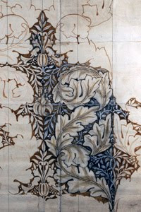
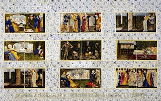
One of these story telling cultures that he so admired was the Norse tradition of aural history. He was so obsessed with one particular tale called The Story of the Sigurd the Volsung that he actually learnt how to speak Icelandic or whatever it’s called so that he could translate and illustrate the tales – now that’s impressive!! However, the exhibition also dedicated a room to his and Burne-Jones’s tile work including a lot of pieces with sleeping beauty and other children’s fairy tales as subject matter. This, the exhibition text argued, was notable as even through an age of literature and news artists such as Morris and the Pre-Raphaelites returned to childhood fairytales time and time again, to escape the somewhat terrifying march of modernity which they all rallied against so strongly. 
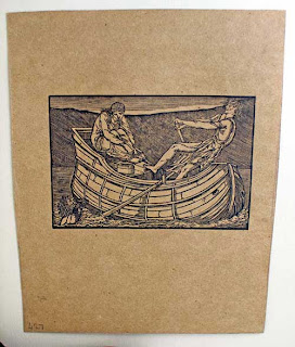
 Other large and glorious tapestries were on show upstairs executed by either the Royal Society of needlework or Morris’s own design firms but the pieces I really enjoyed were the incredibly beautiful etchings by Burne-Jones for an abandoned project to illustrate Morris’s ‘great storybook’ The Earthly Paradise. This work is again perfectly in tune with the theme of the building and therefore high Victoriana in general i.e. the collation of multiple historical sources and inspirations bound together in one book. The stories were bound together by a narrative about a group of medieval wanderers who, thwarted in their search for a land of everlasting life discover instead a surviving colony of Greeks with whom they exchange stories. Thus even though many of the stories and legends in the book date from much more ancient sources the entire tale has a feel of the medieval about it. Morris and Burne-Jones wished to illustrate each tale from this and on display were a series of etchings to illustrate the Cupid and Psyche myth which although I believe were never printed clearly provided inspiration for Burne-Jones in terms of subject and composition in other, later works. Really beautiful stuff.
 I could go on for another 4 pages about all the fabulous things in this show but I need to do some work today so instead I recommend you all visit this amazingly exiting new space – it’s free!!!
Other large and glorious tapestries were on show upstairs executed by either the Royal Society of needlework or Morris’s own design firms but the pieces I really enjoyed were the incredibly beautiful etchings by Burne-Jones for an abandoned project to illustrate Morris’s ‘great storybook’ The Earthly Paradise. This work is again perfectly in tune with the theme of the building and therefore high Victoriana in general i.e. the collation of multiple historical sources and inspirations bound together in one book. The stories were bound together by a narrative about a group of medieval wanderers who, thwarted in their search for a land of everlasting life discover instead a surviving colony of Greeks with whom they exchange stories. Thus even though many of the stories and legends in the book date from much more ancient sources the entire tale has a feel of the medieval about it. Morris and Burne-Jones wished to illustrate each tale from this and on display were a series of etchings to illustrate the Cupid and Psyche myth which although I believe were never printed clearly provided inspiration for Burne-Jones in terms of subject and composition in other, later works. Really beautiful stuff.I could go on for another 4 pages about all the fabulous things in this show but I need to do some work today so instead I recommend you all visit this amazingly exiting new space – it’s free!!! 

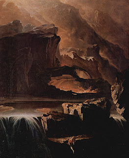


 Martin was someone only comfortable in the Sublime, for domestic idylls go elsewhere which, when the century progressed, the Victorians clearly did. I admire that, this was a man who understood shock and awe, he was a showman, as the popularity of his touring exhibitions demonstrate, and that is why he was initially so roundly embraced, and then so quickly dropped. If you want emotional subtlety or human insight then you better wait a few years.
 From this point on Martin had pretty much found his feet and we start getting the massive apocalyptic style canvases with lots of lightening and the sky falling in. Architectural elements are often included, especially in the early works, along with tiny groups of harried looking figures. It’s this balance between the monumental and the micro that defines his work from this era and if I was going to be all clever I would talk about the Romantic idea of the individual here, but I can’t be bothered and would end up sounding like an ignorant ponce and I do enough of that already frankly.


 Throughout the exhibition I kept hearing insanely loud squealing and crashing noises which were intensely annoying. Especially in the room nearest. I couldn’t work out what all the commotion was about but it turns out the Tate were ‘trying something new’ and had decided to recreate, in a trendy new context, the touring exhibitions of The Last Judgement Triptych. To quote the Tate website:


 Hello all and welcome back to my blog which I missed last week on account of not being arsed to do anything cultural – oops. This week I did quite a number of culturally related activities, however they all took place yesterday and I was rather hungover and out of it and to be honest didn’t quite catch the crest of any of the exhibition waves at any point alas. My cultural companion this week was the delightful Andrew, who I fear I have to apologies to for my slightly out of it countenance!
 The standalone star of the show was definitely the large and incredibly rich oil painting At the Moulin Rouge which I have seen in reproduction but never in the flesh where it is a totally different and jaw dropping experience. When you think of Lautrec, or I suppose when I think of him, one naturally thinks of his strong graphic poster style or his sketchy textured painting style. This piece however was very highly worked with a decidedly choreographed composition (ok well clearly most compositions are well choreographed but you get what I mean!) and was somehow more surprising to me than the other works in the show. It has an incredible seedy air to it; the viewer is drawn towards the conspiratorial group in the centre yet at the same time repelled, turned away at the door perhaps by the sickly and haunting looking woman in the foreground. You’re not quite sure if she is accosting you or turning you out, probably because you are in no way going to be cool enough to hang round with the crème de la crème of avant garde Paris sitting in the centre. The central group, like the majority of the figures in the painting, are portraits of people who frequented or worked at the Moulin Rouge, I could list them but I can’t be arsed. They look engrossed yet somehow disjointed from each other, tightly knit in the same social circle yet you get the impression that each of the protagonists is in someway separate, caught up in their individual cares and concerns. In this group Avril has her back to us, showing us her elaborate coiffure, her high neck richly trimmed coat, and not much else. It seems to be the way Lautrec preferred to depict his favourite model; detached, unapproachable and unknown.
 The only time she doesn’t have this far away look in her eyes is when she is depicted dancing. However, even here she has an unnerving look about her. I didn’t really know much about her before the exhibition and assumed she was just the bog standard high kicking eye brow raising Moulin Rouge style dancer of the day but I was apparently wrong. Avrils fame, which was certainly bolstered by Lautrec yet at the same time independent of him, was linked to her notorious past where she was, for a time, put in a sanatorium style place because of a nervous breakdown or something. The popular press of the day loved to associate her jerky, dangerous dancing style with that of the hysterical woman, a theme close to the heart of the 19th century. This was a reputation which Avril, consciously or subconsciously, allowed to flourish and I can imagine it was the dangerous nature of her dance and her personality that attracted the avant garde of Paris at the time. The underground, unknown and seedy nature of the Moulin Rouge and its famous clientele is where the attraction lay no doubt, the thin line between the elite and the degenerate walked on a daily basis. Lautrecs own illness, mental and physical, was perhaps what attracted him so much to this particular woman. This is well represented in the below work.
 One of the few works on display not depicting Avril was this work of the dancer La Goulue. One of the more risqué performers she was famed for wearing highly controversial see-through dresses for her dances. Here she is depicted in one such plunging outfit standing between her sister and her lover. She is grotesque and looks like one of the ugly sisters in Disney’s Cinderella. She stares at the viewer in a direct and slightly terrifying way. It seems this mix of the exotic, the repulsive, and the sexually deviant is what enticed the crowds of late 19th century Paris.
 After we had done with the Courtauld we wondered up to the National Gallery to see the show Devotion by Design; Italian altarpieces before 1500. I didn’t expect an awful lot from this as it’s just a reorganisation of pieces already in the collection and we assumed it would be in one of the small rooms they use to show free exhibitions in the main section of the gallery near the central foyer place. However, they had actually spent some cash on it and it was situated in the main exhibition space in the basement of the Sainsbury wing. I imagine I have moaned about this place before as it really is one of the worst exhibition spaces in London, which says a lot as my god there are some awful spaces in the main museums, I name the British Museum and the V&A as top offenders. However, like the Relics show currently on at the BM, the curators had embraced the dark claustrophobic gloom of the space and used it to their advantage – low lighting, purple walls and choral music helped create a really quite immersive experience. The central room was particularly fine with those clever pretend spluttering candles and a cross arranged in front of one altarpiece and the room around it arranged to resemble a haunting church to give the viewer a different experience to the usual National Gallery renaissance displays. The show went into some detail about the commercial nature of altarpiece production as well as the techniques and processes involved but to be honest by that point I had reached my information absorption limit and instead I just enjoyed looking at some familiar pieces afresh in a new context.

 We also had a very quick look around another free show there called Forests, Rocks and Torrents; Norwegian and Swiss Landscapes from the Lunde collections. I’m assuming said Lunde collection, wherever that may be, are having some sort of refit or flooding problem and asked the NG to take some of their crap off their hands for a bit so it doesn’t get damp or something because my god this show was pointlessly dull. I thought maybe they would be some Romantic landscapes, and you know I like a bit of the sublime as much as the next person, but there was decidedly no sublime here, no sublime at all:
 Cheerio folks xx
 Hello all

 Anyway, Tyntesfield is an incredible Victorian Gothic masterpiece of a house. As befits its glorious optimism and pretention it was built by the Gibbs family who were self made millionaires, apparently at one point the richest non titled family in England. Even more appropriately their money was mostly made through shit, literally shit – or guano which was popular form of fertiliser made out of bird poo. Hahahaha. Anyway one mans shit is another mans fortune and these guys were seriously loaded – according to the NT website the £70,000 cost of building Tyntesfield - which started in 1863 - represented less than one year's average profits for their firm. It seems money was no object and they could indulge themselves in any architectural whim and decorative fancy they liked including an aviary in the garden built to look like a wendy house which was later converted into an actual play house for the children/grandchildren of the family. The building was designed originally by the architect John Norton with turrets, gables, pointy windows – the whole shebang. The inside is as elaborate, if not more so, than the outside with every surface covered in the most beautiful wallpaper, carvings over every section of wood and ceiling and my particular delight a huge number of tiles, everywhere, my favourite!! These include beautiful tiled gazebos in the garden as well as an amazing tiled roof – every element was patterned and rich, it kind of reminds me of St Chappell in terms of a jewel box of colour, pattern and texture. Its all just SO ARTS AND CRAFTS – it’s amazing!! I lusted after the beautiful Morris-style soft furnishings. Totally gorgeous.


