Friday, 10 September 2010

Week 32: Chinese Prints from the 8th - 21st Century/British Museum

Morning morning one and all it’s Friday again woohoo! Once again I have had to delay my blog writing to the end of the week as have been v busy at work doing lots of research into Shakespeare which has been rather fun. Next stop Winston Churchill, coolio. When I get paid may get round to actually going to see a performance of something Shakespeare, which I haven’t done in about 5 years embarrassingly, and then I will go and visit the cabinet war rooms or something. Anyway, due to the long delay in doing my something cultural (last Saturday) and writing my something cultural today I have unsurprisingly (for me) pretty much forgotten everything about the exhibition I went to see. I will attempt to will up some information and dare I say it even some opinions by plundering the British Museum website. Prepare for a not so impressive cut and paste job.

So, exhibition of the week was The Printed Image in China from 8th-21st Centuries at the British Museum. It feels like I have been to so many shows at the British Museum over the last few months; I think it’s because there have quite good, FREE, prints and drawing exhibitions upstairs which are the perfect size i.e. about 2 or 3 rooms. I made this particular visit with the delightful Nathanial after a very pleasant all you could eat vegetarian curry lunch in Euston. Nat is one of those people who spends about 10 minutes running around an exhibition and is then done and therefore I felt I too had to rush around which is another reason I remember barely anything about it. I will forgive him though as he is clearly rather busy being affianced at the moment. Also it provides me with a good excuse for having a rubbish addled memory.

So prints and drawings; it’s funny really as it occurred to me at the end of this show that the development of printing in different cultures around the world always seems to fit roughly the same pattern: Printing of some kind was invented/introduced, a few people practised it as a fine art, it was taken over by the kitsch and produced for everyday populist consumption, therefore disregarded by everyone and considered unworthy of study or appreciation, the 19th century comes along and everyone decides that low brow prints from various cultures are in fact fab and decide to herald them as new artistic wanders, some sort of revolution, political unrest, war etc comes along and they are used either as state propaganda or by radicals of various leanings to undermine and criticise said state propaganda/rule, then later in the 20th century everyone rediscovers said printing process in some sort of ‘back to peasantry’ ideal and they are once again viewed as artistic and worthy creations. Now admittedly I don’t know much about printing but what I do know seems to ALWAYS fit with this pattern – ALWAYS. There is nothing wrong with that obviously but it can make for quite a formulaic exhibition experience sometime.

China is a good place to start when looking at prints because, obviously being about 2000 years more advanced than us at that time they invented the fucking thing. RATHER impressively, therefore, the BM (which has apparently “one of the most comprehensive collections of Chinese prints outside Asia”) has been loaned a Chinese copy of the Diamond Sutra by the British Library, dating from 868 AD which is the world’s earliest dated printed book!! Pretty impressive you have to admit!! Although it’s not the earliest example of a printed but only the oldest we have bearing a date. By the time it was made, block-printing had been practiced in the Far East for more than a century.

You can look at it online on one of those ‘page turning’ websites here:

http://www.bl.uk/onlinegallery/sacredtexts/diamondsutra.html

Otherwise here is a pic:


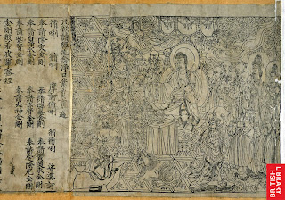
It’s a 5 metre-long scroll and was made from 5 carved woodblocks and was hidden for hundreds of years in a cave in north-west China and not discovered until 1907! Very excitingly the cave was deliberately sealed and hidden at a time when that part of China was at threat but it contained a library of 40, 000 books and manuscripts and was part of a complex known as the Caves of a Thousand Buddha’s – v exciting sounding can you image discovering that?!?! Anyway not only is it the world oldest printed book but it is also, apparently, the most important sacred work of the Buddhist faith. The illustration at the beginning shows the Buddha expounding the sutra to an elderly disciple called Subhuti. Towards the end of the sermon, Subhuti asks the Buddha how the sutra should be known. He is told to call it ‘The Diamond of Transcendent Wisdom’ because its teaching will cut like a diamond blade through worldly illusion to illuminate what is real and everlasting. The relatively short ‘Diamond Sutra’ was popular because it could be memorised more easily than longer sutras and chanted in some 40 minutes. This was important because Buddhism teaches that recitation of sutras ‘gains merit’, that is, helps towards achieving a higher incarnation.

Ok I don’t know anything about Buddhism but apparently one of the teachings is that you earn lots of bonus Karma points (or however it works) by reproducing Buddhist teachings and images which have everyone a really good reason to develop printing techniques and explains the invention, development popularity and circulation of prints in China.

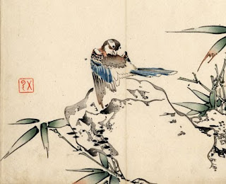
Other earlier stuff they had included some really beautiful flower prints which were skillfully crafted to appear like finely painted images:


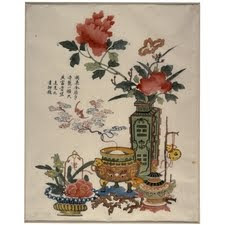
They also had a lot of later prints depicting flowers which was a popular subject matter across several centuries. This was due to flowers being important and sophisticated visual symbols, much like in the west. Examples of flower imagery includes Flowers and Incense, Ding Liangxian from 1720-50. Good old cut and paste job starts here: [The print illustrates] different good wishes which are expressed through a complex combination of symbols. The wish for peace, prosperity and riches in the accompanying verse is echoed by the bronze vessels. The two components of the word for bronze give the meaning 'gold-like' and as objects of antiquity they are regarded as valuable. The word for vase, ping, is a homophone for peace. The vase here is decorated with divinatory trigrams for fire and thunder. It contains peonies, a representation of spring, and orchids which allude to the fragrance of wealth referred to in the verse, as does the burning of incense, xiang. The word for bat, fu, is a homophone for happiness, while the wisps of smoke emerging from the incense-burner has curled into shapes of the lingzhi fungus, the symbol of longevity. Other symbols of spring, like the water narcissus and camellia, suggest that this print was probably used during the Chinese New Year.


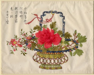
Other flower imagery included Flower Basket (c.1690) by Ding Jinchang. All very pretty.

The exhibition then moved on to later prints. Due to the increasingly urban population of China printing became a staple of the middle classes and increasingly commercial and decidedly kitsch. One of the most popular forms of commercial prints at this time were door guards which were used to hang outside peoples homes to bring good luck, fortune, or health etc. Different door guards were used for different festivals and for different wishes. Popular imagery included warriors and children, in particular boys (obviously).


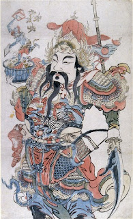
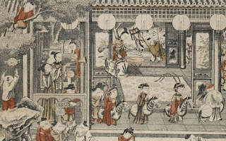
Alas I couldn’t find an image of the truly hideous little boy images they had on display but here is a print produced for the merchant classes with a similar subject matter called ‘One Hundred Children’. It demonstrated the influence of western painting traditions in the perspective and architecture and shows the need for images appropriate to the ever expanding merchant class during this period:

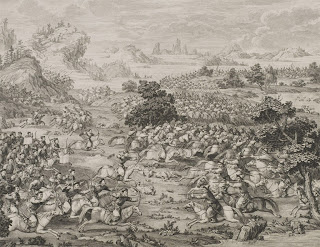
Western influence can also be seen in the emerging fashion for copperplate prints and their use by people such as the Qianlong emperor who used western artistic fashions to have huge paintings made to document his East Turkestan campaign. These were then reproduced as small scale line drawings and then sent to Paris to be engraved by Jacques-Philippe Le Bas and then shipped back to China. This technique was so popular that over subsequent campaigns copperplate engraving was mastered by Chinese printers and produced entirely in China. Images such as The Lifting of the Siege of the Black River Camp (1771) show westernised traditions of history painting along with the modelling of portraits and landscapes:

There was a whole section on prints used as propaganda during the various devastating Chinese political and social upheavals as well as (surprise surprise) its rediscovery and revaluation sometime in the 20th century but god I cant remember much about that.

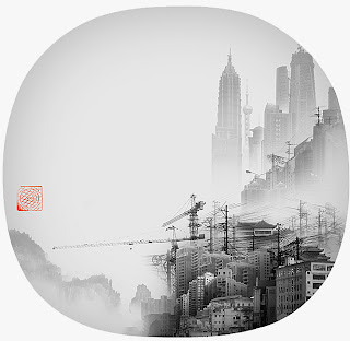
Instead for me the stuff that stood out by far the most were the 20th century and contemporary print sections. Images such as Artificial Wonderland by Yang Yongliang are totally beautiful playing on the Chinese printing tradition:

Chatting over Tea by Wu Jide’s from 1984 is stunning:


Morning on the Huangpu River by Shao Keping from 1962 shows china as an emerging industrial power:


Anyway it was lovely lovely and very much enjoyed – Ciao xx


Friday, 3 September 2010

Week 31: Victoria and Albert/Beatrix Potter/Painting/Jewellery and Architecture


Hey there sadly overlooked blog followers I am once again very late with this weeks blog apologies apologies!! It was my birthday last weekend and have been v busy at work since then so this has fallen by the wayside somewhat - oh well, onwards onwards!!

I didn’t have much culture planned for last weekend preferring instead to spend most of the 3 days in bed eating vast amounts of food but I did manage to stumble upon the perfect exhibition for me quite by accident on the day of my birthday!! Upon waking at quarter to 1 I realised the sun was shining and the birds were singing and I had barely seen daylight in 2 days so dragged the delightful Jason out of bed and insisted we walk to the V&A and spend a little time soaking up some beauty before buggering off to the park to continue the face stuffing schedule. The plan at first was to go to the picture gallery via the jewellery section and then see if we could catch the architecture show which finished on that day. However, along the way we discovered a whole 2 room exhibit of Beatrix Potter drawings which was perfect as I use to be obsessed with her books when I was a kid – an ideal birthday treat for me!

To begin with – the jewellery section has been done up in the last few years I think – I certainly remember it use to be far less exciting looking although you did get to go through massive clunky security gates when going in which I always found quite exciting. I’m not sure when they revamped the place but it really does look fab despite lack of security gates – all black with Perspex bendy show cases and Perspex stairs leading up to the upper floor. Very atmospheric and ideally lit to show off the vast array of sparklines the place houses – amazing!! This time we particularly enjoyed the watch section (on the upper level) with lots of amazingly intricate and delicate yet often huge pocket watches. These were sometimes known as Onions because of their large round shape. One of the ones I particularly enjoyed is below from about 1660ish – very very pretty!!!:


I also really loved all the sparkly tiaras in particular the art nouveau one by Lalique made of glass and horn at the turn of the 20th century, GORGEOUS!!!!:


Anyway, everything in the jewellery bit is lovely lovely you could drive yourself insane trying to chose one piece you would like to take home so we moved on to the painting gallery next.

When I first moved to London and started to inhabit the National Art Library on a weekly, and then daily basis the paintings at the V&A were displayed in a dirty room with walls covered in green felt and I remember distinctly nearly crying when I saw a Rossetti displayed in DIRECT sunlight – literally it was BY the un-curtained window with sunrays hitting it straight on. It was scary. At some point however they happily renovated the place and since then it’s always been my favourite part of the vast and seemingly endless museum. I’ve been there about 4000 times so it’s difficult to discuss it as a whole rather than just the few pictures you bother to look at so I will just pick out a few of the highlights for me:

Disappointed Love by Francis Danby has to be one of my favourites - proper job victoriana-rama:
Why were they so obsessed with this kind of theme in the Victorian era??? I mean, I KNOW why, but, WHY??? As if child birth wasn’t dangerous enough even falling in love could kill you then according to them.

Danby was a complete legend and also painted another of my favourite paintings in the gallery; The Upas, or Poison-Tree, in the Island of Java from 1820 – an amazingly gloomy picture in different tones of black (which makes it rather difficult to see in the gallery – not great lighting still alas) – the story being that convicts were sent to collect poison from the tree back in the day and if they managed by some miracle to make it back alive they were pardoned, coolio. My friend recently went on holiday to Java and it didn’t sound like that at all – quite the opposite in fact, Goldie Hawn was there the day before! Other great pics from Danby include the Deluge at the Tate;

He was clearly rather into the sublime landscape concept!!! Got to love a bit of drama!!!

They have several interesting garden paintings which is always something I enjoy; This Dutch one by Henri de Braekeleer is lovely along with this English one by Charles Robert Leslie always catches my eye due to its extreme kitch-ness. They always have one hanging next to it called the Love Letter which I also really like but I can’t seem to find it anywhere and don’t know the artist – bit of Victorian narrative painting always does me good though.
They also have some fabulous Pre-Raphaelite stuff in particular the wonderful The Mill by Burne Jones which is some sort of metaphor for something and obviously has hints of the three graces, really lovely;


I also love this one by him which I hadn’t really noticed much before in delightful tones of grey called Cupids Hunting field;

I could go on for hours about all the lovely things in this gallery but can’t so instead I will just mention my third Watts spot (it’s been a while) called The Window Seat which is another piece of high Victorian sentimental narrative rubbish – which I LOVE!!! Well done Watts once again;


So, anyway, we were almost done (i.e. Jason was dragging me out) the painting gallery when I realised they have given over 2 rooms to a little Beatrix Potter exhibition called Peter Rabbit; The Tale of the Tale. (88a and 90 if you’re interested) Hurrah!!! I LOVED Beatrix Potter as a child and use to have an extensive collection of her books in miniature which I genuinely loved – I still have a little box with a pull out drawer complete with mini brass door knob with lots of the little books inside in a row which I remember choosing for my birthday present when I was about 7!! My favorite 2 stories were The Tale of Samuel Whiskers or the Roly Polly Pudding, about rats nicely, and the Tale of the Two Bad Mice – I think I liked them so much because they were both largely about food.

This exhibition brought together letters, drawings and paintings by Beatrix Potter from before her first book, The Tale of Peter Rabbit, was published;

“[The tale was] conceived on 4 September 1893 in an illustrated letter to Noel Moore, the five-year-old son of her friend and former governess, Annie Moore. Noel was recovering from a bout of scarlet fever so Beatrix amused him with a story based upon her real pet rabbit, Peter Piper.”

I knew that the tales were conceived in letter form because they use to have that programme on daytime TV which were cartoons based on her illustrations and they always ended with some actress pretending to be her finishing off the letter/story and posting it off after walking past some kids in Edwardian dress playing in a country lane – do you remember it?? Anyway what I didn’t realise is she had always been a bit obsessed with painting rabbits and wildlife in general and was heavily influenced by the pre-Raphaelites, i.e. Ruskin, and passionately believed in the observation of nature and exact reproduction of the natural world around her.

It was a friend who suggested to her that she should turn the stories she continued to send as letters over the next few years into published books. However, she couldn’t get anyone at all to publish them as they all wanted to charge too much and she resolutely believed (in a slightly crazy way) that 'little rabbits cannot afford to spend 6 shillings on one book and would never buy it'. So she decided to publish Peter Rabbit herself for friends and family. Within a few months though someone wanted to publish them, in colour!! And so history was made blah blah blah. The second room of the exhibition was lined with every image + the text from the first Peter Rabbit publication which included 4 images she then removed from further printing runs because they had to make room for end papers or something. It was actually really interesting to see these unknown illustrations as I hadn’t realised how deeply the original ones have been burnt into my subconscious like familiar friends! The ones which were removed clearly hadn’t gone through the extensive process of redesign that the others had undergone over the years and are not nearly as good. Truly lovely show though but was very disappointed to note they had NO Beatrix Potter merchandise to purchase in the shop. On the way out we had a quick look at the architecture show that has now finished called Architects build small spaces;

“Using the landscape of the Museum as a test site, the V&A invited nineteen architects to submit proposals for structures that examine notions of refuge and retreat. From these nineteen concept submissions, seven were selected for construction at full-scale.”

We only saw 3 however. One was by the stairs up to the NAL and was something to do with books and libraries but you had to queue to go in it – fuck that. The other two were together in a very large very dark room off the main reception space. One, by Belo Horizonte, Brazil, was quite fun – you got to go inside and climb up and down stairs with lots of red curtains in random places and windows into the outside world and different parts of the inner architectural space – something about performance and show I think and could be used as a performance space or a viewing gallery for audiences to watch a performance from. I thought it was quite fun;

The last one we saw was beyond rubbish. By an architecture group, or school or something called Rural Studio – something about using reclaimed materials that would not be wanted or needed elsewhere. Good idea and everything but could they not have bothered to actually design something??? All it was was an empty shed- LITERALLY!!!” A box with noting inside and no ends, you just walked through it. Oh and it was made of wood from someplace in Wales – totally crap and not worth the reclaimed wood it was made from. Shame on them.

That’s all folks see you at a more punctual time next week I hope!!!

Monday, 23 August 2010

Week 30: Magnificent Maps/British Library

Hello bloggers long time no hear and it’s all my fault I’m afraid. Last week was the first time so far that I failed to write my cultural one a week and I haven’t even got a very good excuse. Deaths, holidays, drunkenness; nothing has stood in my blogging way until now – alas lethargy was, as always, my downfall and not only did I not write my blog last week but I didn’t even bother to do anything which is pretty damn awful and I can definitely feel my brain shrinking and cultural horizons narrowing. THIS WEEK however I managed to get off my arse and do something although rather ridiculously I didn’t check the closing times of the British Library and thought it closed an hour later than it in fact did so pretty much missed the second half of the exhibit OOPS.

Magnificent Maps; Power, Propaganda and Art is the current, FREE, show at the British Library and is in some form or another in partnership with the BBC. Now, being a Partnerships Coordinator in the department of the BBC that looks after this I REALLY should know more about the exact nature of this collaboration but, well, my knowledge, as ever, is limited. I do know that they have a BBC website devoted to the exhibition with lots of educational value. I know this, in depth, because it’s currently my job to research online teachers resources for the BBC, oh the glamour (I do get to do fun things sometimes as well), and in my now expert opinion I think this is an excellent site. Here’s the link, its quite fun to have a look round and a bit of an ‘interact’ but don’t look too in-depth as am about to cut and paste half the info into this blog:

http://www.bbc.co.uk/bbcfour/beautyofmaps/index.shtml

(By the way for those of you interested there are some uber interesting sites on BBC online which are little known to say the least and no doubt soon to be closed down so have a look while you can. This one in particular is excellent if you’re interested in wildlife which I am not but hear others misguidedly are: http://www.bbc.co.uk/wildlifefinder/)

Anyway, as the BBC and the BL are in cahoots my boss got sent an invite to the private view of this back in May or sometime and as she wasn’t around she kindly gave it to me.


CONTENT REMOVED DUE TO PARANOIA

Unfortunately, as I mentioned earlier, my timings left a little to be desired and missed half the exhibition which means I have now officially been to this show twice yet failed to really see most of it still. Oh well.

So, maps eh, good good, like a bit of old map, doesn’t everyone?? The curatorial concept behind this show seemed to hinge on the idea that historically different types of maps were hung in different parts of the home to fulfil different functions. They therefore divided the exhibition into different domestic spaces to display apparently vastly different types of map. So to begin with we had the long gallery, then the bed chamber, cabinet of curiosities, school room, reception room etc. Now, I think this idea would have worked better if you were some cartography expert and could immediately see the subtle differences in about 300 maps but I am not and therefore this design scheme seemed extremely flimsy and more than a little pointless, well not pointless I do see their point it just didn’t work. It was a bit like a 4am essay writing crisis when you suddenly realise that although your essay works ok and everything mostly fits into your theory it doesn’t stop it being absolute bollocks.

Most of the rooms and most of the maps seemed to fulfil the exact same function as each other which was pretty much (9 times out of 10) to show how rich, knowledgeable and powerful the owner was. No matter what room they were in. So, you can’t help thinking a lot of these maps were just really pretty/interesting/detailed and they wanted to include them for that reason rather than because they fitted into some over arching curatorial point. Which pretty much backs up my experience of all BL shows which is that they seem to often need a damn good edit.

Another point I’d like to make is that as far as I can tell they didn’t have audio guides and there was extremely little info provided on the captions for each map. Instead viewers were intended to use these strange tables in each room of the exhibition which had info and illustrations projected onto them and audio BOOMED out across the whole space in a REALLY off putting way. These tables were small and crowded even though the exhibition wasn’t THAT full so most people didn’t get to see it and instead had the distraction of random bits of disconnected info screeched at them from some unclear source or the inconvenience of not knowing much about the map they’re looking at –not good BL, not good at all although I admire you for trying and the interactive tables would have been fun if you were a kid.

So, pieces from the exhibition. Well lots of them were very very pretty. To be honest I haven’t got a HUGE amount to say about them other than that – oops. GutiĆ©rrez map of the Americas from 1562 had cool sea monsters in it!!:


This MASSIVE one called Fra Mauro World Map is originally from about 1450 and is the oldest world map. Intended for display in Venice, it emphasises the feats of Marco Polo. The British East India Company commissioned the copy on display here, which apparently implies that Britain was heir to the Portuguese empire. It was displayed in the bed chamber for some reason I can’t remember/never fathomed and shows the globe upside down with the holy land at the centre, which has got to mean something important right?

Everyone seemed to go CRAZY over the Grayson Perry Map of Nowhere which was beautifully executed but like everything he does; a lot less meaningful, insightful and funny than he thinks it is:

Some of the maps I really enjoyed were ones which included family trees on them as I think it’s pretty cool to map time as well as space on one image. Examples of these include this great one showing the kingdom James I was to inherit along with his justification, through family tree, of why it was his to rightfully claim. Annoyingly have just spent a good 25 mins looking for this online to no avail – but it’s great!

A quite amusing part of the exhibition had the worlds largest Atlas displayed near the worlds smallest!!:

The largest is The Klencke atlas from 1660 which was produced as a ‘summary of the worlds knowledge’, for the exclusive appreciation of Charles II. The smallest atlas in the world was made by special request for the dolls house of Queen Mary, the one on show still at Windsor Palace and contains like 8 fully detailed maps and is very sweet. Also on display in that room (the cabinet of curiosities room or whatever it was called) were some delightful pocket globes which were apparently all her rage at one point and highly desirable still, would LOVE one of these:

After this I only had 20 minutes to finish the exhibition, get to the shop and pick up my stuff from a locker so sadly I missed the rest but did very much enjoy the small section on maps in poster art including these:


The second being a satirical comment from the 1870s about Russia’s political potency, or something. Anyway haven’t got time to do anymore but all in all this was a nice exhibition with some resounding flaws but beautiful workmanship for a couple of hours quiet contemplation.

Monday, 9 August 2010

Week 29: Le Corsaire/The Bolshoi at The Royal Opera House


I thought I would start this weeks blog off with some reviews of Ivan Vasiliev, the dancer I had the great pleasure of seeing last Monday at the Royal Opera House in the Bolshoi’s production of Le Corsaire:

“Such special artists come along only once in a generation. But now, here's Ivan.” Telegraph
“If you only see one ballet this year, see one with Ivan Vasiliev (…).He is a miracle of physics”
Evening standard

“The Bolshoi's Ivan Vasiliev is beyond compelling. We know from past appearances that this is a man who has carved out his own virtuosity, through the swivelling, scissoring embellishments of his enormous jump and the inhuman assurance of his pirouettes.” Guardian

“…a jump that could start a jet engine… Vasiliev, for his part, must surely be breaking some kind of land-speed record with his repeat slicing leaps. His shape-holding, mid-air, is extraordinary. And his turns on the spot practically smoke. Perhaps most impressive of all, though, is the muscle-dense sculptural quality of his every move, rendering him a granite-hewn colossus from ancient times.” Independent

“When he first visited London with the Bolshoi Ballet in 2007, at just 18, his combination of dashing looks, leonine stage-presence and one-in-a-billion aerial brilliance had jaws dropping at the Coliseum and critics sprinkling superlatives over him like confetti." London Dance

So, pretty impressive stuff and believe me this guy did not disappoint in the flesh! I went to see him with my mum and her friend Sally last week, along with about 2000 other screaming women on heat. My mum had seen some live feed performance direct from Moscow in Bath last winter and immediately ran home to book tickets for their visit this summer, and my god I am glad she did. A few weeks prior to our visit some pantingly hormonal reviews had got out and word had spread that their star dancer, the 21 year old Ivan Vasiliev, was sex on toast with more sex on top and some sex served on the side for good measure and it seems people agreed. I have never seen an audience like this. Obviously when you go to the ballet, even more so than the opera, the audience has a massive female weighting with a few old queens thrown in. But this was something else – this was rows and rows of panting 30 something’s barely able to contain their pure lust. And believe me it’s understandable. Words can not do this guy justice so please please take the time and have a look at this, you wont be sorry:

http://vimeo.com/9575327

LOOK AT THOSE THIGHS!!!!!!! LOOK AT THAT BUM!!!!!!! LOOK AT THAT STRENGH!!! I mean that guy could throw you across the room all right – PHHHHWWWOOOOAR. And then some more PHWWWOOOOOOARRR because this guy is HOT and I just don’t think there are enough PHWWWWOOOOOOOOAAAAARRRRRS in the world to express quite the depth of the appeal of this guy. To put it into some kind of context; usually when you go to the ballet there is a little applaud after every major ‘dance’ (don’t know the technical terms but hey ho am sure neither do most of you so lets not complicate the matter). Here there was a major round of applause every time he LEAPT. We were slightly concerned at first as he was wearing a skirt type thing (pirate story, funny costume not impressed with bum hiding) but then when he reappeared on stage skirt-less in red tights I swear to you there was an AUDIBLE GASP from the audience. Every time he did a leap or a spin or whatever there would be insane giggling from across the auditorium in manner of 16 year old school girls sneaking into the boys locker rooms – and that was only from the over 60s, the pre-menopausal were practically fainting in the aisles - it was HILARIOUS, I have never in my life seen anything like it - my god this guy is worth travelling to Moscow for. He is undoubtedly going to be the biggest thing since Nureyev, he is only 21 now and already a total superstar, and am sure can out dance Carlos Acosta 2 to 1, whatever that might mean.


Anyway, a bit about the actual ballet; Le Corsaire is loosely based on the poem The Corsaire by Byron. All modern productions of Le Corsaire have their roots in the revivals staged by the Ballet Master Marius Petipa for the Imperial Ballet of St. Petersburg throughout the mid to late 19th century. In 2007 the Bolshoi brought forth this new production with Petipa’s choreography partly recreated by Alexei Ratmansky and Yuri Burlaka (thanks Wiki). The story (from what I could vaguely understand as we didn’t get the chance to get a programme) is all about pirates and slave markets and captures and escapes – queue lots of lush and decadent scenery and oriental style costumes all reminiscent of a fabulous Gerome painting – lovely, apart from the afore mentioned skirt which was frankly unacceptable – we need more bums! The first act (3 act ballet) saw lots of Ivan’s amazing leaps and lifts, my god he was good, but alas the following 2 acts barely featured him and you could tell the audience were a little disappointed – one act of Ivan is just not enough! But when he was onstage my god you couldn’t take your eyes off him! The final scene was spectacularly staged with an entire pirate ship swooping onto stage which cracks in two after a fearsome sword fight between the hero and villain. Thank god Ivan and partner survive and the happy ending sees them embracing on the rocks by the turbulent sea.

The 2nd act was also lovely with lots of large ensemble dances (again no idea what they are actually called in the ballet world know they involve the core de ballet though) with ballerinas in pretty pretty tutus holding garlands of flowers etc – very ‘ballet’ and reminded me a lot of the illustrations in my great childhood favorite Angeline Ballerina so my 7 year old heart soared at that point. His partner, Natalia Osipova was also wonderful, especially when spinning around, and, well, this is hard to write but, well unfortunately the two of them are actually together in real life (SOB). Sad, sad news as this is at least we know he isn’t gay so there is hope for us all girlies!! AND he smokes! Be still my beating heart. They do look very cute in the picture below, and I suppose he should be with someone his own age and stuff, humph.


I really can't do this cultural pursuit justice in words, especially not when in a hurry and a hot flush – so here are some more videos for you to enjoy, and believe me you will enjoy them – LOOK at those leaps! LOOK AT THAT ARSE:

http://www.youtube.com/watch?v=76i7ebH0kGI

http://video.sina.com.cn/v/b/28146229-1604091422.html

Enjoy!!

Friday, 6 August 2010

Week 28: Berlin

Woohoo welcome to my holiday blog!! Last week I had the joy of visiting Berlin, and Germany, for the very first time and it was damn good! I stayed with my lovely friend Anthony who now lives out there and kindly put me up on his very comfortable sofa bed for the week – THANK YOU ANTHONY!!! Whoring oneself around friends floors/sofas is definitely the way forward in terms of holiday accommodation/choice (thanks again also Yael!). I intend to scab floor space in New York next – maybe I will never have to pay for a hotel again!!?

So Berlin, what a fascinating city! So much history!! So many crazy things have happened to it!! First though I will start, as always, with the food. Having never been to Germany before I was obviously keen to sample the local cuisine, the most important element of any society/culture, and started with the key element to the German culinary tradition – Kinder Surprise!! Over there though they have about 10 times the number of kinder products and the best by far seems to be Kinder Joy – looks like a Kinder Surprise but is in fact made of plastic and one half is filled with this weird gooey white chocolate concoction with 2 ferrero rocher style chocolates in it and you eat it with a little spoon that comes with – EXCELLENT.


Then I has currywurst – a sausage covered in tomato sauce and curry powder – not impressive frankly – and a schnitzel, yum. I also had a German croissant which is dark brown and made with some sort of savoury element so it’s kind of like having a normal croissant with salted butter – excellent. The best meal by far however had to be that which Anthony’s delightful girlfriend Lea cooked for us (yes it was she who lured him out there with her Germanic-feminine whiles). Annoyingly I meant to send her a message asking her to forward me the name of the dish and a good online recipe but haven’t done that so THINK she made us Kohlrouladen, or cabbage roles, which I THINK the below may be a recipe for, but this also may be wrong!! Either way they were dumpling style things made of cabbage stuffed with meat and baked/roasted and served with yummy sauce and mashed potatoes and more cabbage and were DEFINITLY the nicest thing I had out there – they were delicious. I clearly have Germanic routes as really do love cabbage. It was ace – thank you Lea!!


http://www.recipegoldmine.com/worldgermanI/kohlrouladen.html

Other than that I was delighted with all the beer drinking that goes on out there, and am particularly impressed with the prices – bottles of beer being no more than about 1 euro usually!! Also Anthony introduced me to the concept of walk beers – he claims that it’s more than normal to walk along the street drinking bottles out there, but in fairness it is here too just the people who do it are usually skanky alcoholics. We went to a couple of cool bars – one on a barge sort of thing and one on the 16th floor of a tower block that obviously had amazing views across Berlin – definitely better than paying to go up the Reichstag or whatever. Had a yummy lychee martini.

Right, that’s the culinary aspect out the way – now for the art. I got a little overwhelmed when I got there and actually bought a guidebook (had left the one the lovely Justin had leant me at home but that’s probably a good thing as it was from 2004 or something and clearly would have been miles out of date – that city is changing fast!), there is just so much to do! I ended up spending a small fortune on admissions and as ever was made to truly appreciate the free element of London museums. Also postcards over there are 1 euro EACH!!! What’s that about??? Must have sent about £25 on them alone and was truly horrible having to limit myself in the gallery shops – made me realise that they are always worth it though as basically every other painting I have forgotten about already. My first port of call was clearly the Alte Nationalgalerie, as this is where all the 19th century stuff is. It wasn’t until I got home by the way that I realised I have a whole book called ‘Masterpieces from the Alte Nationagalarie’ which I picked up cheap in a National Gallery sale about 8 years ago and do look at occasionally as has so many pretty pictures in. I have never noticed the name of this book or where it came from before. This is worrying. Anyway, they have some truly fab stuff here and was definitely my favourite of all the many museums I visited. However, I would like to discuss just how shit German audio guides are. They would spend at least the first 4 minutes, which in a gallery is a long time, telling you what’s in the painting, the painting you’re standing in front of – its like ‘yeah I know am looking right at it’. They then tell you how you should feel when standing in front of the painting, again – ‘thanks I’m standing here you don’t really need to tell me that and frankly it’s not only patronising but also highly presumptive and plain irritating’. Then you have to put up with some mindless gush about nothing – and then there is no bloody real information at all at the end of it! I gave up after the first few galleries.

Anyway, highlights of the Alte Nationagalerie have to be works by the amazing Romantic artists Caspar David Frederick and Karl Friedrich Schinkel, the later being pretty new to me. Interesting works by him include Morning (below) which is a comment on Napoleon pissing off finally out of Prussia leading to the dawn of a happy new German era:
Another interesting piece by this artist was Gothic Church as one thing I was able to glean from the hours of audio guide crap was that in this period, as everyone (wrongly) thought Gothicism sprang from Germany, any Gothic element included in a composition/narrative was a sign of German independence and pride, again mostly as a response to the Napoleonic invasion.

Caspar David is always good for a bit of paint and very much did not disappoint in the flesh. Images that particularly stood out were the fabulously gloomy Monk by the Sea and Abbey in the Oakwood which are intended to be viewed as a pair. Apparently Frederick envisioned many of his works as pairs like this as he viewed the world and his art as an ever repeating cycle of life and death – each image has an answer so in this case we have the solitary contemplation of a monk, alone against nature, and in the second we have the funeral of a monk, being guided slowly into the next life through the abbey which has 2 faintly glimmering light above the entrance, the only thing that guides us to the unknowable beyond, the journey we all take alone – etc etc. Anyway I think this is quite interesting.


Some other images I enjoyed from this gallery were those by Franz von Stuck, a symbolist artists who I hadn’t heard of before who not only paints damn well but was clearly CRAZY, having an ego the size of a planet and basically building himself a house to memorialise just how amazing he thought he was – his self portrait below depicts him within this building. Here we also have The Sin and Circe.


They had devoted most of the bottom floor to an artist who I hadn’t heard of but must be pretty important in Germany as, well, they gave him the whole floor! This guy had numerous official commissions, many of them HUGE, and painted an incredible variety of work:

They also had the amazing Manet painting The Conservatory and apparently the first Impressionist painting by Monet:


The next gallery I visited was the Hamburger Bahnhof which is a bit like the Tate Modern meets the Musse D’Orsay as it’s in an old Railway station. I got slightly lost trying to find it (story of the trip) and stumbled upon what I thought was a terribly cutting edge contemporary gallery around the corner but then I realised it was the Haunch of bloody Venison and was a bit embarrassed/disappointed – god damn it!! Anyway, this gallery starts with people like Warhol (the famous and HUGE Chairman Mao) via all the greats of this era moving through minimalism, pop art, video art (a lot – snoar) and various other movements whose names I don’t know as well as a hell of a lot of stuff by Joseph Boys, who I can never really make my mind up about but definitely always makes me feel a bit sick.


While I was there they had a Bruce Nauman show on and it’s like yeah yeah whatever but I did very much enjoy one piece by him, recommended by Anthony, where you walked into a little room filled with bright green light and when you come out everything around you looks bright pink!! Amazing!! The stuff that in many ways interested me the most though was upstairs in these little temporary show spaces – one, Hans-Peter Feldmann was filled with little rotating carrousels covered with children’s toys with lights shining at them casting strange and sinister shadows on the walls:


The other space was filled with a weird collection of giant carved insects teamed with a collection of brightly coloured glass objects which I assume was something of a piss take:

The Gemaldegalerie was where I attempted to make the most of Thursday evening free entrance but fuck me it was a bit of an intense experience trying to get round there in 2 hours. It’s basically the National Gallery times 10 and was a pretty darn impressive collection of art from the Renaissance to about 1800 (I think). Stuff that stood out were the Frans Hals Portraits:

The Holbein’s were mind blowing in the flesh, such amazing painting really took my breath away:

They had some of the great Caravaggio’s including this one which frankly I have always thought completely grotesque:

What I was most excited about seeing though were the Lucas Cranach’s as I LOVE him, and they did not disappoint. What really surprised me though was the size of some of them; I have only seen the little ones in the past and didn’t realise he painted such huge pieces such as The Fountain of Youth which is HILARIOUS – showing old haggard saggy people getting into a big swimming poor and coming out the other side young and beautiful and then going off to a party to have fun and get laid – hilarious:


Earlier that day I went to the Neue Nationalgalerie which was meant to be showcasing artworks from 1900 until about 1960 but seems like half of the place was closed and paid 10 euro’s to go and see about 5 rooms of exhibition space. What they had in those 5 rooms was admittedly wonderful, but 10 euro’s was just a total rip off specially as in my guide book it said it was filled with loads of stuff that just wasn’t there. This particularly annoyed me as the entrance way to this strange place was the entire ground floor of huge museum space totally totally empty apart from some 70s style carpet and an enormous chandelier – what’s the point of that??? I guess space just isn’t at a premium in Berlin. Highlights however included some amazing work by Munch including this great piece of someone called Kessler!! I didn’t actually even notice the name until I got back to London and someone pointed it out to me though just thought it was a beautiful portrait!!

There were some incredible paintings by the expressionist artists Kirchner who I know very little about but knocked out some incredible stuff. This one in particular, of Potsdamer Platz was really breathtaking; depicting the hustle and bustle and disconnected existence of metropolitan living at the turn of the 20th century Berlin.

Some other pieces that really stood out were the beautiful bauhaus style poster art they had on display which annoyingly I cant remember the artist or find anything online for. Oh well. They also had a room full of really beautiful 1920s German Painting. This was the movement away from Expressionism after the First World War towards new sobriety and simplicity – still some expressionist elements but with a more detailed style such as this fab one io girl about town in her little black dress with her packet of Camels:


They also had this fabulous Dada collage, not usually that much of a fan of the Dada but rather like this:
This has all gone on rather too long to say the least so will quickly mention the Jewish Museum which I studied a bit of in first year Courtauld and, although then I thought it was frankly rather naff, in person it worked very well and was extremely effective and full of crying Americans. It was also the place where I got to go on one of those great machines where you squash a penny and print something on it – love those, nothing like a bit of currency debasement on holiday. The Holocaust memorial was also good. I attempted to go to the Stasi museum TWICE – once I went to its old location as guide book was clearly not that up to date and then when I went back to where it has now relocated to it was closed for refurbishment – tres annoying. Did a thousand other things but doubt anyone will have got this far anyway so will leave you all alone and just say a last thank you to Anthony for putting up with me for 5 days!! THANK YOU ANTHONY!!