Morning lovely people and welcome to another One a Week – Week 5!! Woohoo! Am very glad that I have started doing this blog as otherwise there is no way in hell I would have dragged myself out of the house yesterday due to monumental hang-over and it ended up being the only time I witnessed day light the whole weekend OOPS. Unfortunately I had assumed, having read nothing about my chosen pursuit and it being free, that it would be quite small. Imagine my IMMENSE terror when I turned a corner after the first 2 rooms thinking it would be almost over and I had another 95% of exhibition to go!! Ugh definitely wouldn’t recommend going unless you are feeling v. sprightly and able minded/bodied.
So the exhibition in question, recommended by my old man, was Points of View; Capturing the 19th Century in Photographs at the British Library – and, again, it was free!! Amazing! Before I go further I should state, for the record, that this exhibition was certainly very flawed. For one thing it was way too big – pretty much attempting to survey the whole of 19th century photography. Unless this was a MAJOR exhibition in terms of money, time and space I think this was just too wide a theme for the curators to manage. It would have been better, I feel, for them to have concentrated on certain aspects rather than the whole shebang. Another fault was that in comparison to text, of which there was A LOT, there were surprisingly few photographs for a photography exhibition. Also the first 3 rooms or so are devoted solely to the invention and development of photography as a technical process with lots of old cameras and letters between the early pioneers of the discipline on show. My dad found this very interesting and certainly others will too but I am not sure how necessary or productive it was to include this type of extensive information, it may have been better left to the science museum etc.
However, saying all of the above it did occur to me that the photographs displayed here are some of the most important images that the world has produced and seen, well ever really. The modern world, the world as we know it and our attitude and understanding of that world and our place within it has been moulded by these photos and because of these photos. The exhibition covers every conceivable strand of Victorian photography, from post cards, celebrity portraits, scientific photos, ethnographic photos, anthropological photos, war photos, aesthetic photos, domestic photos, travel photos and much much more. Fucking everything you can think of in short. And these images are incredibly powerful and incredibly potent. It would take way too long to discuss appropriately each genre so I shall take just a few examples;
The obvious one to start with would be the anthropological photos on display. And it is here that your mind can get a little blown on a hung-over Sunday or a very tired Monday morning. The Victorians were obsessed with documenting the world around them as the empire kept growing and we found a need to prove and justify our exploitation and dominance over and clear superiority to everyone else. I should point out of course that this was a survey of world photography not just British stuff but frankly you could apply the same understanding to most of the countries who commissioned work or who patronised it. So, the question is what came first the chicken or the egg? The need that the Victorians had to wander the earth and ‘document’ cultures that they saw as fading out, because they were mostly stamping them out, is clearly because of colonial expansion but would they have bothered their arses to document so much if they were just drawing black people pinned up against walls? Would the Victorians obsessive need to catalogue and categorise and document EVERYTHING have been so potent if it had not been for the development of photography? Would photography have developed so quickly and with such success if it had not been for the Victorians need to document everything? I don’t know, this is not the place to thrash out a discussion but is interesting nonetheless. And the images that they produced, colonial images, fake images, true images – they are images that shaped the perception we have of these cultures and places for the next hundred years or more. Even if certain photos have been proven to be manipulated and invented it doesn’t matter, they have entered the public imaginational and they will stay there. The images may be firmly routed in imagination but they permeate the way we view different cultures to this very day.
http://www.bl.uk/onlinegallery/onlineex/pointsofview/themes/science/frogs/index.html
Colonial expansion went hand in hand with the growth of tourism. The growth of tourism goes hand in hand with the desire to document said tourist excursions. The desire to document these excursions leads to the desire to make other people really jealous that they weren’t there. Thus postcards are born! Amazing! The improvement of a reliable post and things like the invention of Christmas cards is also tied up with this surely and open to more intense discussion.
http://farm3.static.flickr.com/2694/4046926876_86421c030e.jpg
Celebrity photography is another interesting example. As you may know I love love love the celebrities and am fascinated by celebrity culture. In some ways our modern understanding and relationship to celebrity and the concept of celebrity dates back to images displayed in this exhibition. On display they had official publicity shots of Oscar Wilde taken during his American tour, Chares Dickens and Baudelaire amongst others. These images were sanctioned and circulated at the bequest of the sitter and usually to their financial gain. Queen Victoria, being amazing as always, was also quick to see the self publicity potentials in circulating official photographs of the Royal family. You can date the current, uneasy relationship between ’celebrity’ and general public to the increasing popularity and demand for images like these. Before this you could imagine celebrities existed in almost a purely ‘fantasy’ world, totally unconnected from the humdrum or maybe not so humdrum lives of their adoring masses. However, with the advent of cheaply circulated, enormously popular images of famous people, which could be easily carried around, taken into the home, stared at on the street – these images were crossing the previously sacred boundary of public and private domains and celebrities became the property of the masses, capable of being worshiped still yes, but also capable of being derided. These images were highly curated by the celebrity in question and produced to maximise on the commercial benefits of their image which in itself is also fascinating. The question of someone’s ownership of their image and patents is also touched on here and is equally interesting.
http://www.bl.uk/onlinegallery/onlineex/pointsofview/themes/portraits/wilde/index.html
Another intriguing comparison between ‘then and now’ provoked by the exhibition were also some of the earliest images to be displayed. When photography was first developing back in the 1850s it was taken up with enthusiasm as a hobby for the leisured classes. Thus there were several images of the moneyed enjoying their country seats and pleasant country pursuits. As photography grew in popularity it was increasingly exploited for commercial ends and was thus dropped as a past time by the rich because of it’s ‘trade’ associations. This I find fascinating as we all know it has since been taken up once again with much enthusiasm in the 20th century and now, most of us have some sort of camera whether fancy digital or crappy disposable. When did photography once again become a hobby? I’m assuming it was sometime in the 20th century when cameras and film made some kind of advance and were easily available commercially but it did strike me that the images on display from as early as the 1850s, were of about the same quality as the photos you get now from most digital cameras. We have gained ease certainly, but what have we lost in terms of quality? I think a lot!
Right this has gone on WAY too long but I would like to briefly touch on some of the later work which unfortunately I was forced to whiz round as they had just announced the shop was closing!!! By the way not a great postcard selection as fucking always. The end of the exhib touched briefly on the development of ‘aesthetic’ photography and the work of a group of people called the Brotherhood of the Linked Ring which is a fab name well done Victorians very weird as usual. This is where we see the debate of photography as art/photography versus art really getting into full swing as the contemporary tastes for painting, i.e. Impressionism and the move into Aestheticism start to bare their influence on styles of photography. I am not going to go too much into this as a) I don’t know much about it (or anything) and b) it would take a thesis but I will just state that these are not only very pretty images but are also very interesting when we consider the development of photography on painting around this time. Monet, Manet, Renoir, Degas etc were all influenced by photography as a way of viewing the world and this in turn effected their artistic style. It was interesting for me to see this process reversed and witness how much art, or painting should I say, influenced photography at this time.
http://ogimages.bl.uk/images/pointsofview/8_1_large.jpg
http://www.bl.uk/onlinegallery/onlineex/pointsofview/themes/progress/centralline/index.html
Right MASSVE exhibition within which anyone in earth would find something to interest them so go – it’s only on until the 7th March.
Monday, 15 February 2010


Monday, 8 February 2010
Week 4: Chris Ofili/Tate Britain
Good day kind blog viewers I very much hope you have had pleasant, fulfilling or restful weeks, depending on your preferences. Spring clean weekend was sadly not delightful for me but very much necessary and luckily I managed to take time out of my busy mopping schedule to have an excellently fancy slap up lunch with the kind parents Hunt after which on slightly boozed up feet I stumbled to the Chris Ofili exhibition at the Tate with daughter Hunt. The combination of full stomach, alcoholic head and the spotting of Nigella and Charles at lunch put us in excellent artistic stead I feel. Particular mention of thanks goes to Georgie here for her loan of Tate membership card. Thank you Georgie xxx
So, Chris Ofili eh? I must admit I am slightly scared of commenting on the great and more importantly contemporary Chris. What the hell do I know about anything made in the last 85 years eh? (or before for that matter) Literally nothing. So I will start by stating simply that I very much enjoyed this exhibition, although not the unbearable crowd of trendy wankers inhabiting it who apparently, since duping total plonkers into inseminating them, no longer have to queue! Given the choice I would definitely choose to go on Wednesday afternoons with the OAPS instead, much less annoying social demographic.
My very favourite part of the exhibition was funnily enough the first thing one encounters when entering; Shithead, which more than sadly can not be found as an image on Google, would have been heralded as a work of pure genius in my household for its name alone. Many, (MANY), an hour have we wasted playing the card game of this name and it causes me great regret that I can not produce a photograph of this wonderful sculpture for you my dearest housemates. Please imagine instead a lump of dung with human teeth, eyes and wool coming out of its head. Fab.
The first few rooms of the exhibition concentrate on the early works which bought Ofili to international attention. These intricate and multi-textured paintings with elephant dung inserted onto the canvas surface also use dung almost as plinths to support the bottom of the canvases as they lean against the gallery walls. I haven’t seen many Ofili’s in the flesh and it is this later use of the dung which I found particularly interesting. Before I go into this (and don’t worry it wont be in much detail) I will touch quickly on the paintings themselves, reproductions of which definitely do not convey the real skill and beauty of the work which have seemingly endless layers of varnish, resin, paint and materials such as glitter and photographs which in combination lend the pieces almost Claude like luminosity. I have nothing against the dung, I like it on some of the works, but I felt that in some of these pieces not only did it seem to exist as an afterthought to the painting, but it also seemed to detract from the incredible depth of the surfaces themselves. With the inclusion of huge round lumps of shit, often with extra collage elements added on top such as beading; the eye was encouraged to travel too speedily over the surface of the paintings making them appear flat in comparison and thus missing out on what I felt was the most interesting element of the work.
As for the dung itself; sometimes I felt it really worked yet sometimes, for me, it was a totally pointless addition. I get that he is interested in the mix of beauty and ugliness and that in some ways that’s a metaphor for the mixture of themes in his work, using spiritual and art historical subjects and interplaying them with often crude elements of contemporary culture such as references to black exploitation films or hip hop. However, did he have to use dung in all of them?? Some of them seemed to really work and the dung felt like an understandable addition; sometimes as a juxtaposition, sometimes as a more thorough incorporation but in each seeming to be a benefit to the piece overall. But several of the paintings, for me, would have been complete works without the addition of random bits of poo such as Afrodizzia which I have included a link to below. In cases such as this it seemed to act as a novelty factor when none was needed.
http://www.tate.org.uk/britain/turnerprize/history/img/1998_afrodizzia.jpg
The use of dung as semi-plinth I found highly intriguing and obviously invests somewhat in the ongoing (is it ongoing?) discourse of the plinth in relation to the gallery space. In the case of Ofili the pieces of shit propping up the images can be viewed as elements within the original work rather than pieces created to display the canvasses, I think, as they were mostly incorporated into the decorative scheme of the overall piece with beading and other elements added to them. Looking round the galleries I loved how the use of the dung in this way bought the pieces into the space of the viewer and these highly textured, tactile surfaces were not hung on the wall as later pieces were. I also loved that, like Brancusi and countless others; the plinths themselves now need to be protected from the visitors. Pieces in the Upper Room series I found ironic as by this point, personally, it did feel like Ofili was propping his work up with shit.
http://graphics8.nytimes.com/images/2006/07/20/arts/20tate2_600.jpg
It was with this in mind that I was glad to move into the later rooms of the exhibition where newer and less familiar (to me) work was shown including some pieces created in the last couple of years. In the film accompanying the exhibition (shown at the end) a lot is made of Ofili’s move to Trinidad and the subsequent effect this has had on his work. The paintings in this part of the exhibition were a real departure, it seems, from his earlier work and I felt his confidence shows through, almost as if they aren’t trying as hard as his earlier work, saying less yet with more strength – if that doesn’t sound too wanky. The spiritual and tribal symbolism is still very present and many of the images reminded me of 1930s tribal inspired fashion plates with the strong use of colour and elongated lines:
http://static.guim.co.uk/sys-images/Arts/Arts_/Pictures/2009/9/15/1253031031235/The-Healer-by-Chris-Ofili-001.jpg
The collection of 4 ‘blue’ pieces using once again the themes of religion and spirituality were particularly haunting and visually stunning and probably my favourite images in the show. Please see below:
http://www.saatchi-gallery.co.uk/blogon/upload/2007/10/ofiliblues.jpg
All in all a really enjoyable, beautiful show and if you are not a huge fan of his earlier stuff still worth seeing as you will definitely get enjoyment out of the visually arresting images later in the show. If you (like me) do enjoy his earlier stuff you may be as pleasantly surprised as me by his later pieces.
See you next week xxxx
So, Chris Ofili eh? I must admit I am slightly scared of commenting on the great and more importantly contemporary Chris. What the hell do I know about anything made in the last 85 years eh? (or before for that matter) Literally nothing. So I will start by stating simply that I very much enjoyed this exhibition, although not the unbearable crowd of trendy wankers inhabiting it who apparently, since duping total plonkers into inseminating them, no longer have to queue! Given the choice I would definitely choose to go on Wednesday afternoons with the OAPS instead, much less annoying social demographic.
My very favourite part of the exhibition was funnily enough the first thing one encounters when entering; Shithead, which more than sadly can not be found as an image on Google, would have been heralded as a work of pure genius in my household for its name alone. Many, (MANY), an hour have we wasted playing the card game of this name and it causes me great regret that I can not produce a photograph of this wonderful sculpture for you my dearest housemates. Please imagine instead a lump of dung with human teeth, eyes and wool coming out of its head. Fab.
The first few rooms of the exhibition concentrate on the early works which bought Ofili to international attention. These intricate and multi-textured paintings with elephant dung inserted onto the canvas surface also use dung almost as plinths to support the bottom of the canvases as they lean against the gallery walls. I haven’t seen many Ofili’s in the flesh and it is this later use of the dung which I found particularly interesting. Before I go into this (and don’t worry it wont be in much detail) I will touch quickly on the paintings themselves, reproductions of which definitely do not convey the real skill and beauty of the work which have seemingly endless layers of varnish, resin, paint and materials such as glitter and photographs which in combination lend the pieces almost Claude like luminosity. I have nothing against the dung, I like it on some of the works, but I felt that in some of these pieces not only did it seem to exist as an afterthought to the painting, but it also seemed to detract from the incredible depth of the surfaces themselves. With the inclusion of huge round lumps of shit, often with extra collage elements added on top such as beading; the eye was encouraged to travel too speedily over the surface of the paintings making them appear flat in comparison and thus missing out on what I felt was the most interesting element of the work.
As for the dung itself; sometimes I felt it really worked yet sometimes, for me, it was a totally pointless addition. I get that he is interested in the mix of beauty and ugliness and that in some ways that’s a metaphor for the mixture of themes in his work, using spiritual and art historical subjects and interplaying them with often crude elements of contemporary culture such as references to black exploitation films or hip hop. However, did he have to use dung in all of them?? Some of them seemed to really work and the dung felt like an understandable addition; sometimes as a juxtaposition, sometimes as a more thorough incorporation but in each seeming to be a benefit to the piece overall. But several of the paintings, for me, would have been complete works without the addition of random bits of poo such as Afrodizzia which I have included a link to below. In cases such as this it seemed to act as a novelty factor when none was needed.
http://www.tate.org.uk/britain/turnerprize/history/img/1998_afrodizzia.jpg

The use of dung as semi-plinth I found highly intriguing and obviously invests somewhat in the ongoing (is it ongoing?) discourse of the plinth in relation to the gallery space. In the case of Ofili the pieces of shit propping up the images can be viewed as elements within the original work rather than pieces created to display the canvasses, I think, as they were mostly incorporated into the decorative scheme of the overall piece with beading and other elements added to them. Looking round the galleries I loved how the use of the dung in this way bought the pieces into the space of the viewer and these highly textured, tactile surfaces were not hung on the wall as later pieces were. I also loved that, like Brancusi and countless others; the plinths themselves now need to be protected from the visitors. Pieces in the Upper Room series I found ironic as by this point, personally, it did feel like Ofili was propping his work up with shit.
http://graphics8.nytimes.com/images/2006/07/20/arts/20tate2_600.jpg

It was with this in mind that I was glad to move into the later rooms of the exhibition where newer and less familiar (to me) work was shown including some pieces created in the last couple of years. In the film accompanying the exhibition (shown at the end) a lot is made of Ofili’s move to Trinidad and the subsequent effect this has had on his work. The paintings in this part of the exhibition were a real departure, it seems, from his earlier work and I felt his confidence shows through, almost as if they aren’t trying as hard as his earlier work, saying less yet with more strength – if that doesn’t sound too wanky. The spiritual and tribal symbolism is still very present and many of the images reminded me of 1930s tribal inspired fashion plates with the strong use of colour and elongated lines:
http://static.guim.co.uk/sys-images/Arts/Arts_/Pictures/2009/9/15/1253031031235/The-Healer-by-Chris-Ofili-001.jpg
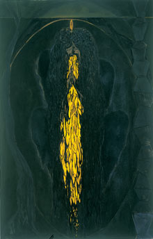
The collection of 4 ‘blue’ pieces using once again the themes of religion and spirituality were particularly haunting and visually stunning and probably my favourite images in the show. Please see below:
http://www.saatchi-gallery.co.uk/blogon/upload/2007/10/ofiliblues.jpg

All in all a really enjoyable, beautiful show and if you are not a huge fan of his earlier stuff still worth seeing as you will definitely get enjoyment out of the visually arresting images later in the show. If you (like me) do enjoy his earlier stuff you may be as pleasantly surprised as me by his later pieces.
See you next week xxxx
Week 4: Chris Ofili/Tate Britain
Good day kind blog viewers I very much hope you have had pleasant, fulfilling or restful weeks, depending on your preferences. Spring clean weekend was sadly not delightful for me but very much necessary and luckily I managed to take time out of my busy mopping schedule to have an excellently fancy slap up lunch with the kind parents Hunt after which on slightly boozed up feet I stumbled to the Chris Ofili exhibition at the Tate with daughter Hunt. The combination of full stomach, alcoholic head and the spotting of Nigella and Charles at lunch put us in excellent artistic stead I feel. Particular mention of thanks goes to Georgie here for her loan of Tate membership card. Thank you Georgie xxx
So, Chris Ofili eh? I must admit I am slightly scared of commenting on the great and more importantly contemporary Chris. What the hell do I know about anything made in the last 85 years eh? (or before for that matter) Literally nothing. So I will start by stating simply that I very much enjoyed this exhibition, although not the unbearable crowd of trendy wankers inhabiting it who apparently, since duping total plonkers into inseminating them, no longer have to queue! Given the choice I would definitely choose to go on Wednesday afternoons with the OAPS instead, much less annoying social demographic.
My very favourite part of the exhibition was funnily enough the first thing one encounters when entering; Shithead, which more than sadly can not be found as an image on Google, would have been heralded as a work of pure genius in my household for its name alone. Many, (MANY), an hour have we wasted playing the card game of this name and it causes me great regret that I can not produce a photograph of this wonderful sculpture for you my dearest housemates. Please imagine instead a lump of dung with human teeth, eyes and wool coming out of its head. Fab.
The first few rooms of the exhibition concentrate on the early works which bought Ofili to international attention. These intricate and multi-textured paintings with elephant dung inserted onto the canvas surface also use dung almost as plinths to support the bottom of the canvases as they lean against the gallery walls. I haven’t seen many Ofili’s in the flesh and it is this later use of the dung which I found particularly interesting. Before I go into this (and don’t worry it wont be in much detail) I will touch quickly on the paintings themselves, reproductions of which definitely do not convey the real skill and beauty of the work which have seemingly endless layers of varnish, resin, paint and materials such as glitter and photographs which in combination lend the pieces almost Claude like luminosity. I have nothing against the dung, I like it on some of the works, but I felt that in some of these pieces not only did it seem to exist as an afterthought to the painting, but it also seemed to detract from the incredible depth of the surfaces themselves. With the inclusion of huge round lumps of shit, often with extra collage elements added on top such as beading; the eye was encouraged to travel too speedily over the surface of the paintings making them appear flat in comparison and thus missing out on what I felt was the most interesting element of the work.
As for the dung itself; sometimes I felt it really worked yet sometimes, for me, it was a totally pointless addition. I get that he is interested in the mix of beauty and ugliness and that in some ways that’s a metaphor for the mixture of themes in his work, using spiritual and art historical subjects and interplaying them with often crude elements of contemporary culture such as references to black exploitation films or hip hop. However, did he have to use dung in all of them?? Some of them seemed to really work and the dung felt like an understandable addition; sometimes as a juxtaposition, sometimes as a more thorough incorporation but in each seeming to be a benefit to the piece overall. But several of the paintings, for me, would have been complete works without the addition of random bits of poo such as Afrodizzia which I have included a link to below. In cases such as this it seemed to act as a novelty factor when none was needed.
http://www.tate.org.uk/britain/turnerprize/history/img/1998_afrodizzia.jpg
The use of dung as semi-plinth I found highly intriguing and obviously invests somewhat in the ongoing (is it ongoing?) discourse of the plinth in relation to the gallery space. In the case of Ofili the pieces of shit propping up the images can be viewed as elements within the original work rather than pieces created to display the canvasses, I think, as they were mostly incorporated into the decorative scheme of the overall piece with beading and other elements added to them. Looking round the galleries I loved how the use of the dung in this way bought the pieces into the space of the viewer and these highly textured, tactile surfaces were not hung on the wall as later pieces were. I also loved that, like Brancusi and countless others; the plinths themselves now need to be protected from the visitors. Pieces in the Upper Room series I found ironic as by this point, personally, it did feel like Ofili was propping his work up with shit.
http://graphics8.nytimes.com/images/2006/07/20/arts/20tate2_600.jpg
It was with this in mind that I was glad to move into the later rooms of the exhibition where newer and less familiar (to me) work was shown including some pieces created in the last couple of years. In the film accompanying the exhibition (shown at the end) a lot is made of Ofili’s move to Trinidad and the subsequent effect this has had on his work. The paintings in this part of the exhibition were a real departure, it seems, from his earlier work and I felt his confidence shows through, almost as if they aren’t trying as hard as his earlier work, saying less yet with more strength – if that doesn’t sound too wanky. The spiritual and tribal symbolism is still very present and many of the images reminded me of 1930s tribal inspired fashion plates with the strong use of colour and elongated lines:
http://static.guim.co.uk/sys-images/Arts/Arts_/Pictures/2009/9/15/1253031031235/The-Healer-by-Chris-Ofili-001.jpg
The collection of 4 ‘blue’ pieces using once again the themes of religion and spirituality were particularly haunting and visually stunning and probably my favourite images in the show. Please see below:
http://www.saatchi-gallery.co.uk/blogon/upload/2007/10/ofiliblues.jpg
All in all a really enjoyable, beautiful show and if you are not a huge fan of his earlier stuff still worth seeing as you will definitely get enjoyment out of the visually arresting images later in the show. If you (like me) do enjoy his earlier stuff you may be as pleasantly surprised as me by his later pieces.
See you next week xxxx
So, Chris Ofili eh? I must admit I am slightly scared of commenting on the great and more importantly contemporary Chris. What the hell do I know about anything made in the last 85 years eh? (or before for that matter) Literally nothing. So I will start by stating simply that I very much enjoyed this exhibition, although not the unbearable crowd of trendy wankers inhabiting it who apparently, since duping total plonkers into inseminating them, no longer have to queue! Given the choice I would definitely choose to go on Wednesday afternoons with the OAPS instead, much less annoying social demographic.
My very favourite part of the exhibition was funnily enough the first thing one encounters when entering; Shithead, which more than sadly can not be found as an image on Google, would have been heralded as a work of pure genius in my household for its name alone. Many, (MANY), an hour have we wasted playing the card game of this name and it causes me great regret that I can not produce a photograph of this wonderful sculpture for you my dearest housemates. Please imagine instead a lump of dung with human teeth, eyes and wool coming out of its head. Fab.
The first few rooms of the exhibition concentrate on the early works which bought Ofili to international attention. These intricate and multi-textured paintings with elephant dung inserted onto the canvas surface also use dung almost as plinths to support the bottom of the canvases as they lean against the gallery walls. I haven’t seen many Ofili’s in the flesh and it is this later use of the dung which I found particularly interesting. Before I go into this (and don’t worry it wont be in much detail) I will touch quickly on the paintings themselves, reproductions of which definitely do not convey the real skill and beauty of the work which have seemingly endless layers of varnish, resin, paint and materials such as glitter and photographs which in combination lend the pieces almost Claude like luminosity. I have nothing against the dung, I like it on some of the works, but I felt that in some of these pieces not only did it seem to exist as an afterthought to the painting, but it also seemed to detract from the incredible depth of the surfaces themselves. With the inclusion of huge round lumps of shit, often with extra collage elements added on top such as beading; the eye was encouraged to travel too speedily over the surface of the paintings making them appear flat in comparison and thus missing out on what I felt was the most interesting element of the work.
As for the dung itself; sometimes I felt it really worked yet sometimes, for me, it was a totally pointless addition. I get that he is interested in the mix of beauty and ugliness and that in some ways that’s a metaphor for the mixture of themes in his work, using spiritual and art historical subjects and interplaying them with often crude elements of contemporary culture such as references to black exploitation films or hip hop. However, did he have to use dung in all of them?? Some of them seemed to really work and the dung felt like an understandable addition; sometimes as a juxtaposition, sometimes as a more thorough incorporation but in each seeming to be a benefit to the piece overall. But several of the paintings, for me, would have been complete works without the addition of random bits of poo such as Afrodizzia which I have included a link to below. In cases such as this it seemed to act as a novelty factor when none was needed.
http://www.tate.org.uk/britain/turnerprize/history/img/1998_afrodizzia.jpg
The use of dung as semi-plinth I found highly intriguing and obviously invests somewhat in the ongoing (is it ongoing?) discourse of the plinth in relation to the gallery space. In the case of Ofili the pieces of shit propping up the images can be viewed as elements within the original work rather than pieces created to display the canvasses, I think, as they were mostly incorporated into the decorative scheme of the overall piece with beading and other elements added to them. Looking round the galleries I loved how the use of the dung in this way bought the pieces into the space of the viewer and these highly textured, tactile surfaces were not hung on the wall as later pieces were. I also loved that, like Brancusi and countless others; the plinths themselves now need to be protected from the visitors. Pieces in the Upper Room series I found ironic as by this point, personally, it did feel like Ofili was propping his work up with shit.
http://graphics8.nytimes.com/images/2006/07/20/arts/20tate2_600.jpg
It was with this in mind that I was glad to move into the later rooms of the exhibition where newer and less familiar (to me) work was shown including some pieces created in the last couple of years. In the film accompanying the exhibition (shown at the end) a lot is made of Ofili’s move to Trinidad and the subsequent effect this has had on his work. The paintings in this part of the exhibition were a real departure, it seems, from his earlier work and I felt his confidence shows through, almost as if they aren’t trying as hard as his earlier work, saying less yet with more strength – if that doesn’t sound too wanky. The spiritual and tribal symbolism is still very present and many of the images reminded me of 1930s tribal inspired fashion plates with the strong use of colour and elongated lines:
http://static.guim.co.uk/sys-images/Arts/Arts_/Pictures/2009/9/15/1253031031235/The-Healer-by-Chris-Ofili-001.jpg
The collection of 4 ‘blue’ pieces using once again the themes of religion and spirituality were particularly haunting and visually stunning and probably my favourite images in the show. Please see below:
http://www.saatchi-gallery.co.uk/blogon/upload/2007/10/ofiliblues.jpg
All in all a really enjoyable, beautiful show and if you are not a huge fan of his earlier stuff still worth seeing as you will definitely get enjoyment out of the visually arresting images later in the show. If you (like me) do enjoy his earlier stuff you may be as pleasantly surprised as me by his later pieces.
See you next week xxxx
Monday, 1 February 2010
Week 3: Revolution on paper: Mexican prints 1910–1960/British Museum
Happy February all, am not feeling the love personally. This week (week 3 of my cultural odyssey for all you not in the know) I had grand plans to go to the Turner show as it was the last weekend and the delightful Georgie lent me her membership card. However, by the time I managed to drag myself out of bed on Sunday couldn’t really face missioning it down to the river so settled for the British Museum exhibition; Revolution on paper: Mexican prints 1910–1960, instead, which had the double bonus of being both near and free. This exhibition had been recommended to me by my lovely Mexican flatmate Javier, but I wish I had thought to ask him what the fuck the Mexican revolution was all about before I went as, alas, the exhibition had not my beloved audio guide and my knowledge was sadly lacking. So, bought to you by the wanders of cut and paste here is a brief summary for all you out there as ignorant as moi:
Between 1910 and 1920, Mexico was convulsed by a socialist revolution that aimed to topple the elite ruling class and improve conditions for society at large. The left-wing government which emerged laid great emphasis on art as a vehicle to promote the values of the revolution.
I love the use of the word convulsed there. This exhibition covered the work of three artists considered to be the masters in this medium: Diego Rivera, José Clemente Orozco and David Alfaro Siqueiros as well as work by printmakers involved in the Taller del Gráfica Popular, or TGP (the national print workshop) as well as the man many considered the father of the Mexican print making tradition; Posada.
Firstly, I was rather disappointed by the work of Diego Rivera whose mural paintings obviously I am familiar with but whose work in other mediums I haven’t really seen before. His were by far the least visually engaging of the ‘three masters’ although I did quite enjoy one of the nudes. The aspect I found most interesting was the label accompanying a portrait of Frida Kahlo which suggested that due to the Hollywood movie (basically) Kahlo is now more famous that Rivera. Haha, you could almost see the curled lip of the curator.
The work I found really stunning was that of José Clemente Orozco who totally blew me away. Please click on the below links to see 2 examples. Some of his pieces reminded me somewhat of Millet in his portrayal of the poor and downcast as identity-free yet monumental and timeless figures, their individual suffering representing the suffering of an entire class/nation. Two images of crowd/demonstration scenes were also amazing and demonstrate (I am assuming) the influence of surrealism on these otherwise documentary style political scenes:
http://www.oberlin.edu/faculty/svolk/landscape.jpg
http://kungfuartcritic.com/static/content/2009/08/vida/07_the_masses.jpg
The exhibition had a good selection of prints by Posada who was particularly famous for his death day prints which, along with large amounts of sadly unintelligible (to me) text, were decorated with images of skeletons acting out various satirical comments on society – SO Mexican!! I particularly liked one called The Graveyard of all the Skeletons which commented on the gulf between the classes in Mexico where the poor are left with unmarked graves whilst the rich have all the lavishness of a proper burial. The print shows the different classes, as skeletons, picnicking together in a graveyard. This reminded me of one of the mini documentaries accompanying an episode of Cities of Gold (amazingly informative and interesting) which discussed the concept of death in cultures like Mexico, where it is seen as a helpful friend accompanying one through life rather than the terrifying grim reaper of judo-Christian theology. These prints were so popular images from them have now been totally assimilated into Mexican visual culture.
http://www.britishmuseum.org/whats_on/future_exhibitions/mexican_prints_1910%e2%80%931960/highlight_objects.aspx
Wrapping this up now but just a quick word about the work produced by the TGP which was a collective of print makers working together in a ‘national workshop’ from 1937 onwards – really beautiful work basically.
Highly recommend this exhibition to all, especially good as it’s free!
Between 1910 and 1920, Mexico was convulsed by a socialist revolution that aimed to topple the elite ruling class and improve conditions for society at large. The left-wing government which emerged laid great emphasis on art as a vehicle to promote the values of the revolution.
I love the use of the word convulsed there. This exhibition covered the work of three artists considered to be the masters in this medium: Diego Rivera, José Clemente Orozco and David Alfaro Siqueiros as well as work by printmakers involved in the Taller del Gráfica Popular, or TGP (the national print workshop) as well as the man many considered the father of the Mexican print making tradition; Posada.
Firstly, I was rather disappointed by the work of Diego Rivera whose mural paintings obviously I am familiar with but whose work in other mediums I haven’t really seen before. His were by far the least visually engaging of the ‘three masters’ although I did quite enjoy one of the nudes. The aspect I found most interesting was the label accompanying a portrait of Frida Kahlo which suggested that due to the Hollywood movie (basically) Kahlo is now more famous that Rivera. Haha, you could almost see the curled lip of the curator.
The work I found really stunning was that of José Clemente Orozco who totally blew me away. Please click on the below links to see 2 examples. Some of his pieces reminded me somewhat of Millet in his portrayal of the poor and downcast as identity-free yet monumental and timeless figures, their individual suffering representing the suffering of an entire class/nation. Two images of crowd/demonstration scenes were also amazing and demonstrate (I am assuming) the influence of surrealism on these otherwise documentary style political scenes:
http://www.oberlin.edu/faculty/svolk/landscape.jpg

http://kungfuartcritic.com/static/content/2009/08/vida/07_the_masses.jpg

The exhibition had a good selection of prints by Posada who was particularly famous for his death day prints which, along with large amounts of sadly unintelligible (to me) text, were decorated with images of skeletons acting out various satirical comments on society – SO Mexican!! I particularly liked one called The Graveyard of all the Skeletons which commented on the gulf between the classes in Mexico where the poor are left with unmarked graves whilst the rich have all the lavishness of a proper burial. The print shows the different classes, as skeletons, picnicking together in a graveyard. This reminded me of one of the mini documentaries accompanying an episode of Cities of Gold (amazingly informative and interesting) which discussed the concept of death in cultures like Mexico, where it is seen as a helpful friend accompanying one through life rather than the terrifying grim reaper of judo-Christian theology. These prints were so popular images from them have now been totally assimilated into Mexican visual culture.
http://www.britishmuseum.org/whats_on/future_exhibitions/mexican_prints_1910%e2%80%931960/highlight_objects.aspx
Wrapping this up now but just a quick word about the work produced by the TGP which was a collective of print makers working together in a ‘national workshop’ from 1937 onwards – really beautiful work basically.
Highly recommend this exhibition to all, especially good as it’s free!
Friday, 29 January 2010
Week One - recap from other blog
This was the first week of my blog just as a re-cap cant work out how to put it in as a previous entry!! For all those only wishing to read this weeks please scrole to the last blog entry!
Week One – The Queens Collection/The Conversation Piece Posted on 13:23 on 18 January 2010 by you Edit Delete Private 33 Views
www.royalcollection.org.uk/microsites/theconversationpiece/MicroObject.asp
****************************Disclaimer*******************************
I haven’t written an essay or anything about art in over 5 years so please appreciate the drivel written below for its quaint naivety!
So, I have never been to the Queens Collection before but tip from me to you; go – its £5 entry (£4 for students and oldies) and with that you get free entrance to all the exhibitions they do for a year! This was excellent news for me as they have a FAB one coming up in March entitled something vomit inducing like ‘Victoria and Albert are in Love’, or similar, and it’s a collection of over 400 objects the royal loved ones bought and gave each other throughout the reign, ahhhh how cute. Anyway am defo going and will inform you of my thoughts when I do – LUCKY YOU!!!
Another top tip = The audio guide was very informative (and free!) and it turned out to be a necessity for full appreciation of the exhibition as the number of deaf old bastards in there with the volume pushed up to the max would have ruined any enjoyment for me if I hadn’t been able to drown them out with my own BOOMING head set.
This gallery is well worth visiting for the amusement of going inside Buckingham Palace alone and I also greatly enjoyed the wide selection of royal family related tourist crap in the excellent gift shop.
The exhibition I visited on Saturday was called The Conversation Piece; a beautiful collection of 17th, 18th and 19th century conversation pieces from the Royal Collection including work by artists such as Stubbs, Landseer, Hogarth and Zoffany and was especially great for me who enjoys all things Victorian excessively. The exhib begins with some truly beautiful Flemish pieces demonstrating how the tradition began, spreading in popularity throughout Europe in the following centuries and adapted to suit the changing tastes of era and nationality.
This exhibition, interestingly, was by no means just a collection of pieces in the Royal Collection, but demonstrated how the popularity of early Flemish Conversation pieces purchased by the Royal Family influenced both what paintings they themselves commissioned in following centuries (thus determining the success of the artists they patronised) but also the very nature of Conversation pieces in general. This is best demonstrated in a truly beautiful and elegant group of 3 paintings commissioned from Stubbs which marries the popular taste for horse paintings and conversation pieces at the time thus creating a hybrid of fashionable tastes of the time and creating a somewhat new genre of painting. The exhibition also discusses how the popularity of all things French in the18th and 19th century influenced Conversation pieces and how the genre of Watteau, Fragonard and Chardin was adapted to suit the British market by investing humour and satire in scenes of fashionable life. The supremacy of Rousseau (wanker) is also evident in the use of informal family portraits of young royals skipping amongst lush rural backdrops – yuck.
The use of conversation painting as tool of royal propaganda was also demonstrated well, particularly in the work commissioned by the ever amazing Victoria who, it turns out, was by far the most prolific monarch in the use of intricately engineered public images – presenting herself as the almost divine image of all things mother, wife and angel of the hearth. God she was fucking amazing. Apparently Queen Charlotte, about whom I know fuck all, was also prolific in this sense and commissioned some truly gorgeous group portraits of her, the heir and the spare. One of my favourite self aggrandising pieces from the exhibition was a scene from St James Park/The Mall commissioned by and containing a portrait of the Prince of Wales of the time, some guy called Fred. He, it appears, was keen to distance himself from the court and wished to project an image of himself as ‘man of the people’ therefore, choosing to have himself painted amidst the London mob complete with squatting dog, a woman with her tits out, another pulling up her stockings and a guy in the background pissing against a tree, haha!
All in all well worth a visit.
Please let me know if you have any suggestions for future outing and also if you fancy coming along! xxx
5 Comments - Add a Comment
Week One – The Queens Collection/The Conversation Piece Posted on 13:23 on 18 January 2010 by you Edit Delete Private 33 Views
www.royalcollection.org.uk/microsites/theconversationpiece/MicroObject.asp
****************************Disclaimer*******************************
I haven’t written an essay or anything about art in over 5 years so please appreciate the drivel written below for its quaint naivety!
So, I have never been to the Queens Collection before but tip from me to you; go – its £5 entry (£4 for students and oldies) and with that you get free entrance to all the exhibitions they do for a year! This was excellent news for me as they have a FAB one coming up in March entitled something vomit inducing like ‘Victoria and Albert are in Love’, or similar, and it’s a collection of over 400 objects the royal loved ones bought and gave each other throughout the reign, ahhhh how cute. Anyway am defo going and will inform you of my thoughts when I do – LUCKY YOU!!!
Another top tip = The audio guide was very informative (and free!) and it turned out to be a necessity for full appreciation of the exhibition as the number of deaf old bastards in there with the volume pushed up to the max would have ruined any enjoyment for me if I hadn’t been able to drown them out with my own BOOMING head set.
This gallery is well worth visiting for the amusement of going inside Buckingham Palace alone and I also greatly enjoyed the wide selection of royal family related tourist crap in the excellent gift shop.
The exhibition I visited on Saturday was called The Conversation Piece; a beautiful collection of 17th, 18th and 19th century conversation pieces from the Royal Collection including work by artists such as Stubbs, Landseer, Hogarth and Zoffany and was especially great for me who enjoys all things Victorian excessively. The exhib begins with some truly beautiful Flemish pieces demonstrating how the tradition began, spreading in popularity throughout Europe in the following centuries and adapted to suit the changing tastes of era and nationality.
This exhibition, interestingly, was by no means just a collection of pieces in the Royal Collection, but demonstrated how the popularity of early Flemish Conversation pieces purchased by the Royal Family influenced both what paintings they themselves commissioned in following centuries (thus determining the success of the artists they patronised) but also the very nature of Conversation pieces in general. This is best demonstrated in a truly beautiful and elegant group of 3 paintings commissioned from Stubbs which marries the popular taste for horse paintings and conversation pieces at the time thus creating a hybrid of fashionable tastes of the time and creating a somewhat new genre of painting. The exhibition also discusses how the popularity of all things French in the18th and 19th century influenced Conversation pieces and how the genre of Watteau, Fragonard and Chardin was adapted to suit the British market by investing humour and satire in scenes of fashionable life. The supremacy of Rousseau (wanker) is also evident in the use of informal family portraits of young royals skipping amongst lush rural backdrops – yuck.
The use of conversation painting as tool of royal propaganda was also demonstrated well, particularly in the work commissioned by the ever amazing Victoria who, it turns out, was by far the most prolific monarch in the use of intricately engineered public images – presenting herself as the almost divine image of all things mother, wife and angel of the hearth. God she was fucking amazing. Apparently Queen Charlotte, about whom I know fuck all, was also prolific in this sense and commissioned some truly gorgeous group portraits of her, the heir and the spare. One of my favourite self aggrandising pieces from the exhibition was a scene from St James Park/The Mall commissioned by and containing a portrait of the Prince of Wales of the time, some guy called Fred. He, it appears, was keen to distance himself from the court and wished to project an image of himself as ‘man of the people’ therefore, choosing to have himself painted amidst the London mob complete with squatting dog, a woman with her tits out, another pulling up her stockings and a guy in the background pissing against a tree, haha!
All in all well worth a visit.
Please let me know if you have any suggestions for future outing and also if you fancy coming along! xxx
5 Comments - Add a Comment
My first Blog entry
Cant work out how to put in previous entries so just copying my first blog entry here:
Eliza's ONE A WEEK - the weekly cultural exploration of ElizaPosted on 10:28 on 18 January 2010 by you Edit Delete Private 13 Views
Hello all!!!
After a summer of lounging around on Hampstead Heath I have found myself in a cultural rut, becoming unacceptably lazy and almost incapable of getting off my arse and doing anything mind expanding (in a legal sense) and consequently becoming a useless empty human being. I have, therefore, decided to do one cultural thing a week at least in 2010 - woohoo me. For all you arty types I know this probably seems like a bit of a measly amount but hey I work in TV now and right over in West London at that where we all know there is no real culture other than Westfield's, and Zarah's flat. Anyway, to keep up the momentum on this I have decided to do a weekly blog (double woohoo me!) detailing my adventures in this high minded pursuit and also, hopefully, getting a few recommendations from all you high brow intellectuals out there. This is all also due to watching Julie and Julia a few weeks ago - very enjoyable despite Amy Adams and her hair. Please be clear that I AM aware this makes me a twat but I don’t care (!!) and this is for friends only anyway who all know I am a twat but are still my friends - thank you open minded accepting forgiving lovely people xxxxx
P.s. I cant spell for shit I don’t care if you don’t like it don’t read it!
Eliza's ONE A WEEK - the weekly cultural exploration of ElizaPosted on 10:28 on 18 January 2010 by you Edit Delete Private 13 Views
Hello all!!!
After a summer of lounging around on Hampstead Heath I have found myself in a cultural rut, becoming unacceptably lazy and almost incapable of getting off my arse and doing anything mind expanding (in a legal sense) and consequently becoming a useless empty human being. I have, therefore, decided to do one cultural thing a week at least in 2010 - woohoo me. For all you arty types I know this probably seems like a bit of a measly amount but hey I work in TV now and right over in West London at that where we all know there is no real culture other than Westfield's, and Zarah's flat. Anyway, to keep up the momentum on this I have decided to do a weekly blog (double woohoo me!) detailing my adventures in this high minded pursuit and also, hopefully, getting a few recommendations from all you high brow intellectuals out there. This is all also due to watching Julie and Julia a few weeks ago - very enjoyable despite Amy Adams and her hair. Please be clear that I AM aware this makes me a twat but I don’t care (!!) and this is for friends only anyway who all know I am a twat but are still my friends - thank you open minded accepting forgiving lovely people xxxxx
P.s. I cant spell for shit I don’t care if you don’t like it don’t read it!
Monday, 25 January 2010
Week 2: The Sacred Made Real/The National Gallery
Hello faithful readers and happy Monday (!?)
Welcome back to Eliza’s One a Week; the Cultural Exploration of Eliza – Week 2. Firstly please can I reiterate that no research or art historical knowledge goes into these entries– for example I’m now pretty sure that the exhibition I went to last week was just 18th and 19th century paintings and not 17th, 18th and 19th centuries as I stated at the time – oops! Luckily seems like none of you noticed - JOKES ON YOU SUCKERS!
For week 2 of the Cultural Exploration of Eliza I decided to visit the current, and soon to be ending National Gallery show ‘The Sacred Made Real: Spanish Painting and Sculpture 1600 – 1700’. Now, before I go further please let me explain that my knowledge of this period is a big black hole. I believe it was covered in term 2 of the survey lectures in first year Courtauld and for any of you who knew me during that (happy) time you may remember that during that period I was somewhat distracted: that term was a bit of a write-off to say the least. So, please may I strongly state in advance that I went to, and sadly no doubt came away from this exhibition as ignorant as could be. Further more, I wish I had read a bit about what this exhibition was before I went as, sadly, I don’t think I would have bothered to spend £12 (including £3 for the not great audio guide) on it if I had known!
So, to begin; ooh, how lovely, thought I, a nice exhibition full of pretty Velasquezs and Francisco de Zurbaráns and no doubt some very lovely sculptures from the period, ooh I canny wait. Huh!! Imagine my shock and consternation when I entered the dingy basement of the National Gallery to find myself in some kind of warped Madame Tussauds of death; a mix of kitsch theme park from the 1970s called something like ‘Lancashire World’ and a creepy haunted toy shop of hell.
It all seemed ok to begin with, more than ok as when I initially entered before me was one of my all time favorite paintings: The Vision of Saint Bernard of Clairvaux, also known as
‘The Miracle of the Lactation’ by Alonso Cano. Please see below. I heartily recommend doing so as it’s hilarious.
http://therule.files.wordpress.com/2008/07/miraculous-lactation-of-st-bernard-1302.jpg
Briefly; this is an image of St Bernard praying before a polychrome (multi-coloured to all you hoodlums out there) statue of the Virgin Mary. As he was such a good monk said statue comes to life and shoots a big old stream of milk from the holy nipples right into his mouth, oh lucky him! Funnily enough, this is not intended just to freak out viewers but demonstrates the bodily, palpable nourishment provided by the mother of god to her worshippers, apparently. It also demonstrates an interesting dichotomy upon which the whole exhibition was based; namely that during this period strict guild systems controlled the production of arts and crafts in Spain, no great surprise there. Polychrome religious sculptures were, it seems, incredibly popular during this time and it was decreed that only sculptors would carve the statues (out of wood) whilst painters were the ones who must colour them in. Because of this many painters trained in sculpture work shops to learn the technique, including Velasquez. This has lead many, including it seems the curator of this exhibition, to argue that this close collaboration of painter and sculptor lead to major breakthroughs in painting during this period, namely the development of realism and the lending of sculptural three-dimensionality to the painted surface. If I knew more about this I would argue the (surely) massive tenuousness of this claim, luckily I don’t but in short: really??? Michelangelo??? Hmm.
As amusing as St Bernard is it’s about as far as I go in terms of appreciating the creepier strands of Catholicism in art - little did I realise this was a portent of the freaky shit soon to come. On turning my back on the thirst quenched St Bernard I beheld a severed head, of John the Baptist, in a glass box. In the next room life sized full length, dressed, statues of various monks, saints and other historical religious figures bore down at me from the corners of the room brandishing crosses and looking really fucking pissed off. Later there were similar images of Christ in various stages of death. No offense but I have seriously never seen such a collection of hideous lumps of wood in my entire life. It was totally freakish and sick. The audio guide explained the significance of these as inspiring worship and humility etc through the shocking images which viewer/worshipper could relate to in a physical sense, but fucking hell. One, which I will attempt to attach an image of, was a torso and head of Christ literally COVERED in blood with glazed eyes made out of glass and finger nails made out of horn etc, It was vomit inducing – please see image below.
http://static.guim.co.uk/sys-images/Guardian/Pix/pictures/2009/6/9/1244541882672/Sacred-Made-Real-Christ-a-016.jpg
There were a few parts of the exhibition where the curator successfully demonstrated this dichotomy between painting and sculpture such as in the room dedicated to Zurbarán where 2 beautiful paintings by him were exhibited (see below) and shown next to a sculpture by Pedro de Mena; Saint Francis standing in Ecstasy, which was based on one of the paintings. This reminded me of the freaky wax dolls used to exhibit the latest Paris fashions back in the day which you can see at the V&A and funnily enough back in the 19th century when both paintings and sculpture found huge fame the V&A tried to buy a copy of this statue. Mini-monk is possibly the weirdest part of the exhibition but I can see why these paintings found such popularity during the 19th century as they really are very beautiful~;
http://images.suite101.com/1326897_com_stfrancisi.jpg
https://blogger.googleusercontent.com/img/b/R29vZ2xl/AVvXsEi4mQ7lXgX39_FEbzFNTCJWxxpguWUKDdwZNo6xVs9eSPhSqB2wQwnY1TAtxWaio_XR_ikoCWlEbPSiLyDKyBzIBDacGQAu6pgERm5H-Pbq-WdZLZto4YCI-aSbtYgunRfWpKtyrLRzVcI/s400/240_450_zurbaran-francois.jpg
Anyway that’s me gone on plenty long enough so I will wrap it up here but basically this exhibition gave me to heebie-jeebies and would NOT recommend taking children. I guess it’s good that sculptures which was massively popular at the time should be given the attention they’re due but frankly I think a whole show at the National Gallery may have been over-egging it a bit because they really were absolutely disgusting. There were a few lovely paintings but by no means enough to make up for that collection of dusty tat. Back to some nice pretty Victorian stuff next week if possible.
Welcome back to Eliza’s One a Week; the Cultural Exploration of Eliza – Week 2. Firstly please can I reiterate that no research or art historical knowledge goes into these entries– for example I’m now pretty sure that the exhibition I went to last week was just 18th and 19th century paintings and not 17th, 18th and 19th centuries as I stated at the time – oops! Luckily seems like none of you noticed - JOKES ON YOU SUCKERS!
For week 2 of the Cultural Exploration of Eliza I decided to visit the current, and soon to be ending National Gallery show ‘The Sacred Made Real: Spanish Painting and Sculpture 1600 – 1700’. Now, before I go further please let me explain that my knowledge of this period is a big black hole. I believe it was covered in term 2 of the survey lectures in first year Courtauld and for any of you who knew me during that (happy) time you may remember that during that period I was somewhat distracted: that term was a bit of a write-off to say the least. So, please may I strongly state in advance that I went to, and sadly no doubt came away from this exhibition as ignorant as could be. Further more, I wish I had read a bit about what this exhibition was before I went as, sadly, I don’t think I would have bothered to spend £12 (including £3 for the not great audio guide) on it if I had known!
So, to begin; ooh, how lovely, thought I, a nice exhibition full of pretty Velasquezs and Francisco de Zurbaráns and no doubt some very lovely sculptures from the period, ooh I canny wait. Huh!! Imagine my shock and consternation when I entered the dingy basement of the National Gallery to find myself in some kind of warped Madame Tussauds of death; a mix of kitsch theme park from the 1970s called something like ‘Lancashire World’ and a creepy haunted toy shop of hell.
It all seemed ok to begin with, more than ok as when I initially entered before me was one of my all time favorite paintings: The Vision of Saint Bernard of Clairvaux, also known as
‘The Miracle of the Lactation’ by Alonso Cano. Please see below. I heartily recommend doing so as it’s hilarious.
http://therule.files.wordpress.com/2008/07/miraculous-lactation-of-st-bernard-1302.jpg

Briefly; this is an image of St Bernard praying before a polychrome (multi-coloured to all you hoodlums out there) statue of the Virgin Mary. As he was such a good monk said statue comes to life and shoots a big old stream of milk from the holy nipples right into his mouth, oh lucky him! Funnily enough, this is not intended just to freak out viewers but demonstrates the bodily, palpable nourishment provided by the mother of god to her worshippers, apparently. It also demonstrates an interesting dichotomy upon which the whole exhibition was based; namely that during this period strict guild systems controlled the production of arts and crafts in Spain, no great surprise there. Polychrome religious sculptures were, it seems, incredibly popular during this time and it was decreed that only sculptors would carve the statues (out of wood) whilst painters were the ones who must colour them in. Because of this many painters trained in sculpture work shops to learn the technique, including Velasquez. This has lead many, including it seems the curator of this exhibition, to argue that this close collaboration of painter and sculptor lead to major breakthroughs in painting during this period, namely the development of realism and the lending of sculptural three-dimensionality to the painted surface. If I knew more about this I would argue the (surely) massive tenuousness of this claim, luckily I don’t but in short: really??? Michelangelo??? Hmm.
As amusing as St Bernard is it’s about as far as I go in terms of appreciating the creepier strands of Catholicism in art - little did I realise this was a portent of the freaky shit soon to come. On turning my back on the thirst quenched St Bernard I beheld a severed head, of John the Baptist, in a glass box. In the next room life sized full length, dressed, statues of various monks, saints and other historical religious figures bore down at me from the corners of the room brandishing crosses and looking really fucking pissed off. Later there were similar images of Christ in various stages of death. No offense but I have seriously never seen such a collection of hideous lumps of wood in my entire life. It was totally freakish and sick. The audio guide explained the significance of these as inspiring worship and humility etc through the shocking images which viewer/worshipper could relate to in a physical sense, but fucking hell. One, which I will attempt to attach an image of, was a torso and head of Christ literally COVERED in blood with glazed eyes made out of glass and finger nails made out of horn etc, It was vomit inducing – please see image below.
http://static.guim.co.uk/sys-images/Guardian/Pix/pictures/2009/6/9/1244541882672/Sacred-Made-Real-Christ-a-016.jpg
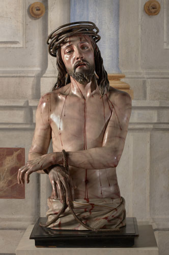
There were a few parts of the exhibition where the curator successfully demonstrated this dichotomy between painting and sculpture such as in the room dedicated to Zurbarán where 2 beautiful paintings by him were exhibited (see below) and shown next to a sculpture by Pedro de Mena; Saint Francis standing in Ecstasy, which was based on one of the paintings. This reminded me of the freaky wax dolls used to exhibit the latest Paris fashions back in the day which you can see at the V&A and funnily enough back in the 19th century when both paintings and sculpture found huge fame the V&A tried to buy a copy of this statue. Mini-monk is possibly the weirdest part of the exhibition but I can see why these paintings found such popularity during the 19th century as they really are very beautiful~;
http://images.suite101.com/1326897_com_stfrancisi.jpg

https://blogger.googleusercontent.com/img/b/R29vZ2xl/AVvXsEi4mQ7lXgX39_FEbzFNTCJWxxpguWUKDdwZNo6xVs9eSPhSqB2wQwnY1TAtxWaio_XR_ikoCWlEbPSiLyDKyBzIBDacGQAu6pgERm5H-Pbq-WdZLZto4YCI-aSbtYgunRfWpKtyrLRzVcI/s400/240_450_zurbaran-francois.jpg

Anyway that’s me gone on plenty long enough so I will wrap it up here but basically this exhibition gave me to heebie-jeebies and would NOT recommend taking children. I guess it’s good that sculptures which was massively popular at the time should be given the attention they’re due but frankly I think a whole show at the National Gallery may have been over-egging it a bit because they really were absolutely disgusting. There were a few lovely paintings but by no means enough to make up for that collection of dusty tat. Back to some nice pretty Victorian stuff next week if possible.
Subscribe to:
Posts (Atom)