Tuesday, 19 July 2011

Week 35??? Various Cultural Events in Paris and London

Dear all

Welcome back to my blog, and welcome back to me. I have had many requests to restart my one a week over the last few months (yes honestly I have) and as I have been so so culturally smug over the last few days I thought I may as well write down some of my activities. This isn’t going to be nearly as long as it use to be though, I just don’t have the motivation no more no more – lucky you.

So, last week I went to Paris to visit the beauteous Cerise and Gautier – thank you for having me C and G! I booked very last minute and at great expense so that I could be there in time to see the show Manet, the Man who Invented Modernity at the Museé d’Orsay which ended on Sunday. I love love love Manet, him and David really are the top dogs as far as I’m concerned, so this show wasn’t to be missed. Here is what they had to say at the d’Orsay:

“More than a one man retrospective for Edouard Manet (1832-1883), the exhibition Manet, the Man who Invented Modernity explores and highlights the historical situation around him, including the reaffirmed legacy of Romanticism, the impact of his contemporaries and the changes in the media at the time.”

Now it may very well have been about that but seeing as the translated text was so bloody appalling I literally wouldn’t know – seriously Museé d’Orsay pull your hand out of your pocket and pay someone who actually speaks English to do your translation work for you – seriously awful, they had invented words!! I wouldn’t mind this if they hadn’t then paid to have someone print these words out and stick them up in massive letters on a wall. Piss poor. Also, if it really was about the historical situation and changes in the media at the time shouldn’t they have had at least one mention of Japanese influences? This all sounds like I was disappointed by the exhibition but believe me I wasn’t, it was fab and they had some lovely lovely pieces in there – although none at all from London as far as I could see which was a shame. Actually in reality the majority of the best ones are in the d’Orsay anyway. But hey was lovely lovely to see them all together. Here were some of my highlights:


It was a very hot day so didn’t hang round the rest of the museum long after the exhibition, which I feel guilty about as really it is my favorite museum/gallery in the world ever, but did pop by to see the Courbet’s, which have been rearranged over the last few years at some point so the massive window they were sitting next to is now covered and you can therefore actually see the top half of the Burial at Ornans and the Artists Studio rather than having them totally hidden by the glare. Also always a joy to see Couture’s Romans of the Decadence, Manets former teacher.


Other than fostering a new TV obsession (Misfits, bloody brilliant) my only other major cultural activity in gay Paris was a visit to the Museum of Decorative Arts in the Louvre. Now I mustn’t be unfair, we actually missed out most of the 19th century unfortunately as their floor plan is very confusing and the museum closed, but bugger me it was a boring trip. I do know one person who would be interested in medieval cupboards, but I think that person is pretty damn rare and I defy anyone to be inspired by a room of veneered side boards from the 17th century. They had some lovely Art Nouveau and Art Deco pieces, but it didn’t make up for the 2 and a half hours of mostly boredom. Here is one of the few images I could find online:


I returned from Paris early on Sunday morning, dumped my stuff at home and headed back out again to meet my mum for another exhibition and a ballet, how motivated is that. The exhibition was Treasures from Heaven; Saints, Relics and Devotion in Medieval Europe at the British Museum. The subtitle was basically; Catholicism, how weird can that be?? and featured some amazing pieces of gold stuff along with items like the first pictorial representation of Christ in Britain. For a BM exhibition it was amazingly well curated, didn’t feel like you were squeezed into a strange snail shape that doesn’t fit like it usually does + I liked all the dimmed light, purple velvet and spooky choral music in the background. Well done BM.


After seeing that bunch of freaky weird shit we headed to The Coliseum to see Sir Frederick Ashton’s Romeo and Juliet staring possibly the love of my life Ivan Vasiliev dancing with his REAL LIFE fiancé Natalia Osipova. These two are hot stuff. I went to see Ivan dance a Le Corsaire at the Royal Opera House back in August 2010 (http://elizakessler.blogspot.com/2010/08/week-29-le-corsairethe-bolshoi-at-royal.html)
where he had QUITE an effect on the packed, braying crowd of crazed women. This time he did not disappoint, and was on stage for more than the first act which was an improvement, but it was her who really stole the show – she moved like water!! The set and production were very minimal but the costumes were fab and that music is always, always going to be a hit. I wish they had snogged each others faces off at the end though. I bet they have amazing sex. .


Anyway people that’s me and my reinstated although considerably shorter blog for this week – tune in next week! (maybe…) xx

Wednesday, 20 October 2010

Week 34: Skin/The Wellcome Collection


Hello long ignored bloggers – apologies for my lengthy absence from blog land I have been rather busy of late doing such exciting things as going to France, coming back, looking for a happy new abode and being ill. Great. I also keep being given work to do – what’s that about?!?! Anyway, I haven’t got time to properly fill in the last 3 weeks of cultural pursuits so will have to do a quick version of each instead. This is actually quite a relief not least because after 3 weeks I have pretty much forgotten everything I have seen/thought about what I’ve seen but also because the last London exhibition I went to (with the fair Georgiana) was one of the more disturbing experiences I have ever had in a gallery space – and I went to the Courtauld…

Is it normal to go round a gallery with an expression of cringing, wincing pain and disgust on ones face? Well if you haven’t experienced that before then get ye selves down to Skin at the Wellcome Collection pronto, if you have a strong stomach that is. I don’t quite know what I expected but jeeze, it wasn’t this!! The exhibition started off well enough with some slightly grizzly although definitely bearable medical style representations of skin from, like, the past, at some point. These presented skin as something that must be peeled away and discarded in order to get to the ‘true’ interior of the body; an irrelevant layer between the outside world and the interior biological functions of the human form. I know skin is meant to be the biggest organ and stuff but frankly I still kind of see it like that too I guess, apparently that’s not good:


But then the exhibition moved to much more disgusting territory – mostly thanks to the, you’ve guessed it, VICTORIANS!!! Unfortunatly the most vomit inducing stuff, in particular the wax work models of street Urchins in various stages of death because of hideous skin afflictions were really enjoyable (???) - luckily for you I can't find any images of these, or the more distrurbing objects and art works on show, but just look at this stuff:


There was also some more arty more contemporary stuff present, but luckily I don’t really remember most of that, or have managed to block it out more like;

Really really disgusting exhibition, which one can’t help thinking bit off way more than it could chew. How can one exhibition successfully unite all scientific interest in skin across history and geography at the same time as exploring the obvious cultural implications of the word in both contemporary work and throughout time?? However, it was definitely interesting, and most definitely disgusting –and if I remember rightly free!!!

Thursday, 16 September 2010

Week 33: Lots of things at Tate!!

Hello one and all. Late as ever this week and am majorly rushing this blog as I am going away tomorrow and have to write this in 30 minutes before I bugger off the for the weekend woohoo!! This weeks cultural pursuit was four-fold – impressive huh!? I stepped out with my lovely friends Nat and Zarah and soaked up the many sites of the Tate Britain – probably my favourite gallery in London, probably. On at the Tate at the moment are the following: Rachel Whitbread Drawings and an exhibition about Eadweard Muybridge; the pioneering 19th century photographer. They also have an installation by Fiona Banner in the Duveen Galleries and a weird installation recently acquired by the gallery by Mike Nelson called The Coral Reef, all of which we saw – not bad eh!?

So, to start with the worst; Rachel Whitbread. I want to punch this women in the face. For one thing she is totally miserable looking cow and an all round pretentious twat. For another thing she has been reproducing the same idea for her entire career, but most importantly that idea wasn’t even hers to begin with right?!?!!?? Didn’t Bruce Nauman cast the empty space below a chair in 1970-something??? Has no one else ever thought about this??? She ripped off Bruce Nauman to begin with and hasn’t actually thought about anything else since or developed the idea in any real way??? MADNESS. I mean once the negative space of one domestic object has been cast do we really need to do the same with a house, with a table, with a load of boxes?? Thank god she was commissioned to do that Turbine Hall piece of crap and everyone else finally realised this women is a waste of space – it was the worst installation in the turbine hall there has ever been!! Yet for some reason the general public is expected to pay to go and see a shabby little exhibition of her proprietary sketches – it takes the piss!! This exhibition walked a fine line between shoddy IKEA prints and the sketch book of a derivative 16 year ld art A level pupil. NOT GOOD, just look at some of this pointless crap:

Inspiring no?! I literally can’t believe the arrogance of this women to dare to display this, she should be strung up. Luckily I hear her career has, rightly, nose dived of late so at least there is some fairness in the world. There is actually a little booklet accompanying this exhibit??? Shame on you Tate, SHAME.

Next we have the Coral Reef by Mike Nelson. This is what the Tate website has to say about it:

“To enter Mike Nelson's The Coral Reef is to enter a parallel world. Rooms, doors, passageways, all bear traces of habitation and decay. Different, often conflicting, ideologies or belief systems are presented through these traces. The implied occupants of Nelson's world appear to be detached from the political and economic centre, left to exist at the margins of globalised, capitalist society. The work's title alludes to this collection of complex, fragile belief systems that form an obscured layer - a coral reef - beneath the 'ocean surface' of prevailing orthodoxies. Nelson's absent protagonists occupy positions of resistance in the face of dominant ideologies. However, Nelson perhaps conveys a sense of inevitable futility about such resistance. In his words, he wants the spectator to feel 'lost in a world of lost people'’”


So, there you go, that makes loads of sense to me, really it does (???). The installation was lots of fun if rather gross, everything looked like it had been pissed on and left to fester. It’s really quite gross and looks like a dodgy cab firm somewhere in east London or a squat which smells a bit. Things I did like were the sense of confusion and claustrophobia and the way he had created rooms that looked exactly the same so walking round in the maze of corridors and squeaky doors was highly disorientating and unnerving. What was it all about?? I have no, fucking, clue! But it was fun!! I have to say I find this type of installation a bit dull though – what’s with the endless amount of ply wood in contemporary art? It makes me feel a bit sick in the way people feel sick about untreated wooden lolly pop sticks on ice lollies, which funnily enough we all had after we left. Ummm, ice lollies. I also don’t like that type of set design installation art – it feels somehow very, very basic; the creation of a domestic space seems somehow prosaic and like a bit of a cheat – meaningful yes but 2 dimensional and cheesy. But that’s just my opinion obviously. I know this is a highly stupid word to apply to any form of ‘art’ but it just feels terribly terribly contrived and although this is only 10 yearsd old feel like it has been done 3000 times before/ Maybe he was the first? Huh, certainly wish he had been the last.


Next up, or rather the first thing we saw, was the installation by Fiona Banner. Annoyingly I took some great photos of this but didn’t bring my iphone cable today so cant download them onto here!! I may try later. The show consisted of 2 great big war style fighter planes, or whatever they would be called. One was hung from the ceiling by its tail bit pointing straight down and almost reaching the floor. This was quite fun I thought, mainly because t looks like they strung it up using only one wire – which is pretty impressive! The other plane is lying on its back and is very very very shiny. Really really fun actually as you can see the reflection of the people and the gallery space in the high gloss finish of the plane. I am guessing, maybe, that this was all about the how these big old instruments of war and death can be put into an almost whimsical setting and seen both as displaced almost meaningless toys (almost), objects of beauty and powerfully dangerous vessels at the same time. The shiny shiny surface gave the sense of speed, beauty and elegance yet lying on its back in the middle of a gallery the fighter jet, or whatever it was, was rendered totally worthless, meaningless and docile. I guess it was also to do with the fascination we all have with war, power and death and the fragile relationship we have to these concepts. This dangerous and industrial instrument can be seen as a plaything, a thing of beauty and much more. Or WHATEVER. Saying all this only one of the planes was shiny, the other was all mat and dirty looking so there was obviously something going on in that contrast, what I can’t be bothered to pontificate on though. Anyway it was mucho fun but maybe I liked it so much because it was like a mirror and I am very, very vain!!


Last and not least we had the retrospective of Eadweard Muybridge. You may be wondering what the hell that name is all about and basically the guy was clearly a bit mental and not only changed his surname for some reason but also adopted the weird medieval spelling of his first name as well – very Victoriana. This guy was a bit mental in general really – he shot his wife’s lover and got away with it as the general belief at the time was it was the wife’s lovers fault and he shouldn’t have done it?! Ahh how the world has changed. Despite the murder and subsequent court case being international news he went on to be a hugely celebrated public figure and now they have a bloody exhibition at the Tate! 150 years later or whatever! Just shows you eh? – what I don’t know though.


The main reason for the longevity of his fame lies in the fact that he was the one who first managed to photograph a galloping horse, therefore proving that they did indeed take all hoofs off the ground at points when galloping. He went on to photograph many action style things including people walking around (naked) and horses doing various things. He managed to achieve this by developing shutters an trip wires and things like that – I don’t know I don’t find that particularly fascinating to be honest and believe me once you have seen one set of stills showing horses running around you really don’t need to see 2 HUGE ROOMS filled with them, especially as the naked ones are all quite gross because apparently everyone was a bit saggy in the 19th century – god he even took ones of himself when OLD – uggggh, old bearded man walking round naked – gross. Anyway there was then a room about how he used these images to develop the moving image by investing something called a Zoopraxiscope which was basically a slide projector going round on a disc thus creating the sense of movement – or whatever. Those of you who ever visited the now defunct Museum of the Moving Image may remember seeing them there – very Victorian faire ground and he did in fact send many years touring the world with these type of shows. One thing I did find interesting were the images he made of water. If you think about it this would have been the first time veer people could see what actually happens in slow mo when water spills, moves, splatters etc – previously they would only have seen it as a solid mass. That’s quite interesting if you think about it and interesting in relation to his earlier works covered in the first half of the exhibition. This was when he went round various parts of the Yosemite Valley in California, a newly developing tourist destination. His huge, beautiful photographs captured new tourist spots as well as creating tourist spots himself by finding new and exciting views and vistas to photograph. I find the development of photography in parallel to tourism, and vice versa, very interesting. He was also employed to photograph the development of the railway in California, including some great images of the Chinese population working out there, and lighthouses and stuff. Many of these early images were done using that technique that I haven’t got time to look up the name of where you have 2 slightly different images of the same subject are stuck next to each other and using glasses to view them the spectator has a sense of three-dimensionality. This was fun.


I haven’t got time to go into any more details as need to leave in 10 minutes and have managed to write this whole blog in less than 30 which I think is quite impressive!! I will just briefly touch on how interesting it was to see this exhibition of photography which so clearly influenced major artistic developments at the turn of the 20th century. They had on display a bronze horse by Degas which was directly influenced by Muybridge’s horse photos. What with my highly Greenberg-ian art historical education and the total unwitting infiltration of the Shock of the New I am use to seeing how artists such as Manet, Degas, Braque, Delauny and Picasso were influenced by photographs like this and their articulation of a new world built on action, movement and speed so it was interesting to view the images by themselves, rather than in relation to other artists, However, I have to say exhibitions like this, as in the photography one I went to see at the British Library a few months ago, get confused about whether they are a retrospective of the photographer (artists as photographer?) or an examination of the development of photography as a scientific process and art form in general. What do you want to be???

Anyway enough is enough must fly!! See you next week boys and girls xxx

Friday, 10 September 2010

Week 32: Chinese Prints from the 8th - 21st Century/British Museum

Morning morning one and all it’s Friday again woohoo! Once again I have had to delay my blog writing to the end of the week as have been v busy at work doing lots of research into Shakespeare which has been rather fun. Next stop Winston Churchill, coolio. When I get paid may get round to actually going to see a performance of something Shakespeare, which I haven’t done in about 5 years embarrassingly, and then I will go and visit the cabinet war rooms or something. Anyway, due to the long delay in doing my something cultural (last Saturday) and writing my something cultural today I have unsurprisingly (for me) pretty much forgotten everything about the exhibition I went to see. I will attempt to will up some information and dare I say it even some opinions by plundering the British Museum website. Prepare for a not so impressive cut and paste job.

So, exhibition of the week was The Printed Image in China from 8th-21st Centuries at the British Museum. It feels like I have been to so many shows at the British Museum over the last few months; I think it’s because there have quite good, FREE, prints and drawing exhibitions upstairs which are the perfect size i.e. about 2 or 3 rooms. I made this particular visit with the delightful Nathanial after a very pleasant all you could eat vegetarian curry lunch in Euston. Nat is one of those people who spends about 10 minutes running around an exhibition and is then done and therefore I felt I too had to rush around which is another reason I remember barely anything about it. I will forgive him though as he is clearly rather busy being affianced at the moment. Also it provides me with a good excuse for having a rubbish addled memory.

So prints and drawings; it’s funny really as it occurred to me at the end of this show that the development of printing in different cultures around the world always seems to fit roughly the same pattern: Printing of some kind was invented/introduced, a few people practised it as a fine art, it was taken over by the kitsch and produced for everyday populist consumption, therefore disregarded by everyone and considered unworthy of study or appreciation, the 19th century comes along and everyone decides that low brow prints from various cultures are in fact fab and decide to herald them as new artistic wanders, some sort of revolution, political unrest, war etc comes along and they are used either as state propaganda or by radicals of various leanings to undermine and criticise said state propaganda/rule, then later in the 20th century everyone rediscovers said printing process in some sort of ‘back to peasantry’ ideal and they are once again viewed as artistic and worthy creations. Now admittedly I don’t know much about printing but what I do know seems to ALWAYS fit with this pattern – ALWAYS. There is nothing wrong with that obviously but it can make for quite a formulaic exhibition experience sometime.

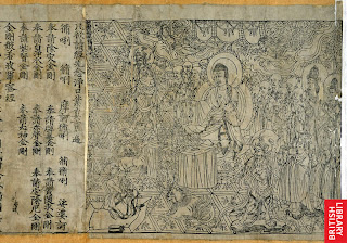
China is a good place to start when looking at prints because, obviously being about 2000 years more advanced than us at that time they invented the fucking thing. RATHER impressively, therefore, the BM (which has apparently “one of the most comprehensive collections of Chinese prints outside Asia”) has been loaned a Chinese copy of the Diamond Sutra by the British Library, dating from 868 AD which is the world’s earliest dated printed book!! Pretty impressive you have to admit!! Although it’s not the earliest example of a printed but only the oldest we have bearing a date. By the time it was made, block-printing had been practiced in the Far East for more than a century.

You can look at it online on one of those ‘page turning’ websites here:

http://www.bl.uk/onlinegallery/sacredtexts/diamondsutra.html

Otherwise here is a pic:


It’s a 5 metre-long scroll and was made from 5 carved woodblocks and was hidden for hundreds of years in a cave in north-west China and not discovered until 1907! Very excitingly the cave was deliberately sealed and hidden at a time when that part of China was at threat but it contained a library of 40, 000 books and manuscripts and was part of a complex known as the Caves of a Thousand Buddha’s – v exciting sounding can you image discovering that?!?! Anyway not only is it the world oldest printed book but it is also, apparently, the most important sacred work of the Buddhist faith. The illustration at the beginning shows the Buddha expounding the sutra to an elderly disciple called Subhuti. Towards the end of the sermon, Subhuti asks the Buddha how the sutra should be known. He is told to call it ‘The Diamond of Transcendent Wisdom’ because its teaching will cut like a diamond blade through worldly illusion to illuminate what is real and everlasting. The relatively short ‘Diamond Sutra’ was popular because it could be memorised more easily than longer sutras and chanted in some 40 minutes. This was important because Buddhism teaches that recitation of sutras ‘gains merit’, that is, helps towards achieving a higher incarnation.

Ok I don’t know anything about Buddhism but apparently one of the teachings is that you earn lots of bonus Karma points (or however it works) by reproducing Buddhist teachings and images which have everyone a really good reason to develop printing techniques and explains the invention, development popularity and circulation of prints in China.

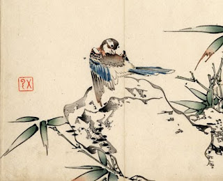
Other earlier stuff they had included some really beautiful flower prints which were skillfully crafted to appear like finely painted images:


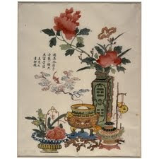
They also had a lot of later prints depicting flowers which was a popular subject matter across several centuries. This was due to flowers being important and sophisticated visual symbols, much like in the west. Examples of flower imagery includes Flowers and Incense, Ding Liangxian from 1720-50. Good old cut and paste job starts here: [The print illustrates] different good wishes which are expressed through a complex combination of symbols. The wish for peace, prosperity and riches in the accompanying verse is echoed by the bronze vessels. The two components of the word for bronze give the meaning 'gold-like' and as objects of antiquity they are regarded as valuable. The word for vase, ping, is a homophone for peace. The vase here is decorated with divinatory trigrams for fire and thunder. It contains peonies, a representation of spring, and orchids which allude to the fragrance of wealth referred to in the verse, as does the burning of incense, xiang. The word for bat, fu, is a homophone for happiness, while the wisps of smoke emerging from the incense-burner has curled into shapes of the lingzhi fungus, the symbol of longevity. Other symbols of spring, like the water narcissus and camellia, suggest that this print was probably used during the Chinese New Year.


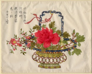
Other flower imagery included Flower Basket (c.1690) by Ding Jinchang. All very pretty.

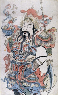
The exhibition then moved on to later prints. Due to the increasingly urban population of China printing became a staple of the middle classes and increasingly commercial and decidedly kitsch. One of the most popular forms of commercial prints at this time were door guards which were used to hang outside peoples homes to bring good luck, fortune, or health etc. Different door guards were used for different festivals and for different wishes. Popular imagery included warriors and children, in particular boys (obviously).


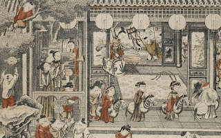
Alas I couldn’t find an image of the truly hideous little boy images they had on display but here is a print produced for the merchant classes with a similar subject matter called ‘One Hundred Children’. It demonstrated the influence of western painting traditions in the perspective and architecture and shows the need for images appropriate to the ever expanding merchant class during this period:

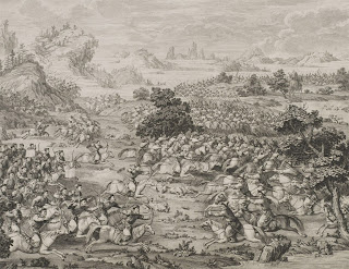
Western influence can also be seen in the emerging fashion for copperplate prints and their use by people such as the Qianlong emperor who used western artistic fashions to have huge paintings made to document his East Turkestan campaign. These were then reproduced as small scale line drawings and then sent to Paris to be engraved by Jacques-Philippe Le Bas and then shipped back to China. This technique was so popular that over subsequent campaigns copperplate engraving was mastered by Chinese printers and produced entirely in China. Images such as The Lifting of the Siege of the Black River Camp (1771) show westernised traditions of history painting along with the modelling of portraits and landscapes:

There was a whole section on prints used as propaganda during the various devastating Chinese political and social upheavals as well as (surprise surprise) its rediscovery and revaluation sometime in the 20th century but god I cant remember much about that.
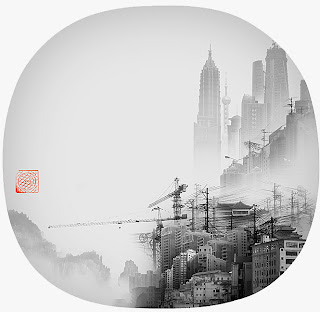
Instead for me the stuff that stood out by far the most were the 20th century and contemporary print sections. Images such as Artificial Wonderland by Yang Yongliang are totally beautiful playing on the Chinese printing tradition:

Chatting over Tea by Wu Jide’s from 1984 is stunning:


Morning on the Huangpu River by Shao Keping from 1962 shows china as an emerging industrial power:


Anyway it was lovely lovely and very much enjoyed – Ciao xx