Tuesday, 20 July 2010

Week 26: Art from the New World a Big Brash Exhibition of the New American Art Scene/Bristol City Art Gallery

Hola boys and girls. I would apologise for my slightly condensed version of blog last week had a bit of busy/nightmarish week and alas had to skip what would have been a sparkling insightful laugh fest (???) but by the sound of it (and yes Chris I mean you) it was a relief. For anyone who missed the point though I did pretty much fully approve of the Serpentine Pavilion.

So, this weekend I went home and enjoyed the delights of the Bristol City Museum and Art Gallery – which I LOVE. We use to go there pretty much every rainy weekend throughout the majority of my childhood (if it was sunny we went to Bristol Zoo) and it’s great, highlights include the glow in the dark semi-precious gems where you get to press the button to make them glow and the Egyptian mummy remains which are displayed in a way that forces small children to balance their entire bodies over the side of this pit filled with sand and it’s only when your face is about 4 inches away that you see this gross mummified skeleton head thing starring at you – it’s terrifying and great! Anyway it still smells exactly the same which is nice and actually has some really nice pieces in the art gallery upstairs. It also has lots of touring exhibitions and this weekend we had Art from the New World a Big Brash Exhibition of the New American Art Scene. This is what they have to say about it online:

“Art from the New World features a collection of 49 new works by a diverse range of some of the finest emerging and noted living US urban and new Contemporary artists, spanning the artistic spectrum from pop surreal to neo-figurative to street”

So that’s nice. What a weird, but cool exhibition. You all know I know NOTHING about contemporary art – here or in the states, so I don’t really know how much this work is part of some kind of new ‘school’, but it certainly seemed very different and yet pretty coherent as a whole! I very much approve of what the exhibition leaflet claimed they were all trying to do which is basically to get contemporary art off its jumped up pedestal and allow it to appeal to a wider audience using a ‘low brow’ visual language influenced by things like comic books, tattoo art and children’s illustrations. Influences of Pop Art and Surrealism (and all the many shades of the various movements in-between) are clear throughout the show as well as a definite lean towards ‘whimsy’ (my new favorite art word ‘cause it makes you sound less thick than just saying ‘that work is FUNNY’).

To be honest I cant’ really think of anything to write which sweeps the entire exhibition apart from the words kitsch, kitsch and WOW THAT’S REALLY KITSCH, so I will concentrate on individual pieces instead. I do, however, really very much approve of anything that ‘low-brows’ contemporary art, and the further away from conceptualism, the most elitist school of anything across any medium ever, the better.

One of the ones I particular enjoyed was Wet Tea Party by Natalia Fabia - I tried scanning this but gave up after 8th go so the one below is 'similar' the the one I saw. Lots to be said about this along the lines of female sexuality, ideals of femininity, narrative imagery – blah blah blah. I really like it because it’s weirdly Victoriana – playing with traditions of femininity, feminine spaces and the Victorian narrative painting. It’s also beautifully executed.


Resurrection by David Stoupakis also deals with contemporary attitudes to female beauty, celebrity, age and obviously religion.
(DARN cant find a pic of this on internet sorry al! - it's basically a naked, agenign beatuty surounded by red roses ala American Beauty dripping in blood against a black background)

I loved the work of artists such as Marion Peck, who were clearly influenced by children’s illustrations to create a nostalgia seeped but unnerving world where painterly traditions such as in this case the equestrian portrait have been played with and subverted to create a feeling of an eerie, distant world of faded childhood memories:


Similar, surreal worlds are seen in the work of Kukula:


Some of the pieces, although very enjoyable, had definite elements of A-Level Art piece to me. A bit too ‘sun moon stars’, swirly colors and long pre-raph hair stunk of a 16 year old girls wet dream for me really. I feel somewhat torn as I quite liked them, but tacky didn’t really do them justice.

Some of the pieces were clearly influenced by comic books, video games and graffiti art such as the work of Buff Monster who is apparently featured in some video by Banksy – who is everywhere in Bristol. To be honest although enjoyable this work to me seems highly derivative and very dated surely?


Anyway have to go as have shit to do for once but another artist definitely worth mentioning is Eric Joyner for this rather hilarious and totally surreal image (one in show not online but this similar idea):


All in all if this is what’s coming out of the states at the moment for the most part I’m very pleased – it may not be earth-shatteringly original stuff but I like the idea of bringing art back from the avant-garde and imbuing it with a really palpable language of cultural references. Thumbs up.

Tuesday, 13 July 2010

Week 25: The Serpentine Pavilion/Kensington Gardens

Well, it was very red:

Would it have been any good if it wasn’t red?
Does it matter?
Can colour be the only element of an architectural scheme?
Were ‘pavilions’ created purely to enable architects to do the professional equivalent of wanking into a cup?
Is the Serpentine Pavilion the most middle class place in London/the world?

Wednesday, 7 July 2010

Week 24: Sketching

Dear all. Apologies for my slight lateness of blogging this week – not that any of you CARE! To be honest my blog this week is a bit of a cultural cop out which I will blame wholeheartedly on Sam and Zarah who DISTRACTED me from my cultural do-gooding by sitting on my balcony for too long on Sunday and totally sapping all my cultural motivation. Instead we all decided to decamp to Hyde Park and do some ‘sketching’ – and yes that DOES count as a cultural pursuit so there.

So, sketching. I did A-level art, being a pathetic girl, and the joy of that experience turned me off creating anything artistic for nearly a decade. This was due entirely to my retarded art ‘teachers’ who frankly should have been struck off. I mean talk about money for old rope; they would turn up, sit around in class reading the paper and occasionally, VERY occasionally, comment on the stuff we were doing – usually along the lines of ‘oh why don’t you make it into a lino print’. Knowing what I know now it was actually quite criminal– I was doing bloody proto-cubist stuff and it didn’t even occur to them to point me in the direction of a book on Picasso etc – luckily I was able to make that connection myself but still, it was really pathetic. Luckily towards the end of the A-level ‘experience’ we all went on a day trip to Salisbury where they were having, if I remember rightly, a really rather good sculpture exhibition around the city. Of course we didn’t bother to look at any of that being 16 – instead we went to the pub, ate cheese on toast and then got tattoos done hahahahahaha!! Teacher was SO shit scared made up for the massive bollocking we all got from the head of Sixth Form on our return – he thought he was going to lose his job!!! HAHAHAHAHA - that served the lazy useless fucker right wish he had been bloody fired. Humph.

Anyway, that said sketching, or ‘draftsmanship’ as they insisted on calling it back in the day for some reason, was always my (only) strong point in the study of ‘art’. I couldn’t paint for shit, really didn’t get on with those lino prints at all and frankly messing round with clay is just like messing round with your own shit really isn’t it? Not that we would have got the chance anyway the kilns were over in the GNVQ scum (as we fondly called them) block and we didn’t go there for fear of being beaten up. Now that I think about it though most of the people in my A-level class were pretty damn scummy themselves – I think a good two thirds of them went on to do ‘Interior Design’ at ‘University’!?! Ahh apart from my friend Nicky of course we were the only points of reason in that shitty shed of madness. Photography obviously wasn’t considered an art form back in provincial West Country world. Whatever, sketching was my strong point – either in pencil or pen, although I do remember enjoying a bit of charcoal in my time. (Gosh isn’t this an enjoyable ramble all about ME – is anyone still reading??)

Post A-levels however I literally didn’t put pencil to paper again for about 9 years because the experience was so damn awful. This all changed about a year and a half ago when my then boyfriend moved into a rather nice flat in Kentish Town. He had a very large window in his living room/kitchen which overlooked the car park at the back and more importantly some very cool old school Victoriana warehouse style buildings now clearly turned into posh or not so posh flats. Point is I decided to do a drawing of this view and slowly worked away at it for many a month until we broke up and he refused to give it back. I was actually pretty much more upset about losing the drawing than about losing the relationship which says a lot – I had invested a lot of time in both after all!! What really annoyed me/annoys me still is that he almost certainly binned it, or worse (I have visions of him and his wanker brother dancing round a bonfire throwing my possessions in one by one and chanting evil spells as they stuck pins into blonde haired wax dolls) because he didn’t even want it and I really really did!! After that I swore I would do another, BETTER picture next time I came across a conveniently placed view. It took about a year for this to happen but having now moved into my swanky swanky new flat with THE LOVELY KIND JUSTIN (happy now boy?) I have such an opportunity at hand; the view from our balcony is ACE – the back of all those old school Victoriana London town houses and muses and there is even a blue plaque etc – it’s ideal! I bought my sketch pad (A2 – am thinking big for this one people) and pencils a good month ago and hadn’t got round to starting it until this weekend though oops!!!

So, back to the matter in hand – off we went to Hyde Park in the surmounting wind, to find the perfect spot somehow encompassing our various needs: sun, shade, privacy (away from roads and more importantly evil police – NEVER had that problem on the Heath) a view of architecture of some kind (have no interest in drawing trees or hills or god forbid people!) and not too far from the toilets. We finally settled on quite a windswept spot overlooking Kensington Palace and the sketching began, for a good 30 minutes at least!! The problem is I was quite far away and it was sunny so couldn’t see THAT well. I enjoy doing the details in sketching – the textures of brick or whatever, which is why the view from my balcony is so perfect, not so much the overall ‘form’ which was clearly what this picture needed. I decided to take a short break when Zarah, the professional artist who even did it as a degree (!!) took over and did her own which very much did take in the overall ‘form’ and made me feel bad L. It also started to get colder and windier as we had spent most of the sunny part of the day smoking on the balcony - so that was the end of that really. HOWEVER, not to be deterred for long I have now been inspired to start the actual, official, view from the balcony and so far all is going well. Unlike last time I have actually sketched out the overall view first before I start beavering away at them there bricks and am rather impressed with my foresight. So far I have completed a whole section of wall!! Some people may think my extreme attention to texture and detail slightly OTT but that’s really what I enjoy doing!! It also adds a real sense of achievement to the finished product, not that I have experienced that sense of achievement for 9 years now thanks to my STOLEN drawing.

Anyway, it was only took 9 years to remind myself that sketching could be quite fun if it’s not being produced for a deadline or to be viewed by all the bitchy commoners in your class. It doesn’t matter if the end product looks like shit as it’s only being done for my enjoyment – I’m not being graded or judged on it so who cares!! It’s very much like my experience doing this blog – finally 5 years post Courtauld I have just about managed to shake any of the limited art historical discourse from my head and am now once again allowed to just walk into an art gallery and enjoy a fucking picture – not because of who painted it, not because of what it relates to in the art historical canon, not because Roger Fry said it was good – but just because I enjoy it!! Similar deal with this.

It’s also a highly beneficial experience for my fragile and highly strung mental state - there is something totally calming and therapeutic about just switching off and thinking about the texture of tiles for a while every day. This is why I enjoyed doing the last drawing so much (god knows I needed to switch off in that flat) and this is why am very excited about the summer/autumn ahead doing this one. I expect it to be finished in about 4 – 6 months depending on how quickly I get bored. When I have finished I will frame it and put it up on the wall near said view whether flatmate objects or not! However, am VERY dedicated already – I actually got off my arse and went across the road to the shop to buy a rubber on Monday!! Yes I ACTUALLY left the house for a reason other than tobacco which just shows my extreme and impressive level of commitment. On a side note though do you remember at school everyone use to laugh when you said rubber because it supposedly meant condom?? Does anyone use that term anymore?? On that note see you next week chums xxx

Tuesday, 29 June 2010

Week 23: Wolfgang Tillmans/Serpentine Gallery

Hello pursuers everywhere, despite major dental surgery this week am still on the ball in blogland woohoo me. This week I used up my get out of jail free cultural pursuit card; the Serpentine Gallery. I live 5 minutes walk from Hyde Park (smug smug smug) so it was always my back up for v lazy (and hot, prey to god there are more like that) weekends when couldn’t be bothered to travel anywhere. Am already planning on 'going to the pavilion' and also maybe 'going to see something at the pavilion' - ooh a fantastic summer of blogs awaits...? Anyway, I dragged my codined-up self from the shady fab spot had been languishing in for 5 hours and managed a whole 25 minutes of standing up and looking at art before collapsing back in the exact same spot for another hour or so. God I love summer.
The show: Wolfgang Tillmans. So, a few weeks ago I wrote an even more crap than usual blog about a really rather good photography exhibition I had seen at the Tate Modern. Somewhat, I suspect, to many peoples dismay and consternation I vocalised my belief, which still stands, that almost any photograph can look 'good' if blown up, framed well, and put on the wall of a gallery. Obviously anyone who knows about photography (unlike me clearly) will disagree with this, which is fine, but they must surely agree that Wolfgang Tillmans has made a career out of doing just that, in the best best possible way. I mean his entire canon seems to be about making things look good by hanging them in certain, differing ways, or at least that’s what they seemed to think in the little booklet that came with the exhibition. His work is all about placing random, lets face it in many cases pretty damn standard pictures on walls in different interesting ways and seeing what happens. Pieces from different times in his career (apparently - I didn’t read the labels) are juxtaposed, creating interesting cross references and associations, changing the meaning of pieces from the way they would have been viewed in different settings. I like this idea a lot, and I liked SOME of the images, but a hell of a lot of them were a load of crap, I mean I get the latent romanticism of the domestic and all that but a lot of these were either boring, badly realised, or, well, boring. That’s fine though I enjoyed it mostly for the over arcing concept anyway.

I like the site-specific nature of his work and also the way he articulates my personally experience of moving through a gallery space. This is particularly strong when in galleries which I know well, with pieces I have studied or really love; they are all like old friends who you are meeting briefly in a crowd, or like having a conversation you have had over and over again but changes constantly and never gets boring. Each piece speaks to the others, saying different things depending on what you look at, in what order, at what time, depending on where they are placed in relation to each other – etc, I love that!!
Anyway, enough of all that gush. One thing I will say for the guy is that he really bought the best out of the space. I can’t remember the last time the Serpentine looked so fab. The last few shows I remember seeing there (obviously not going that often) have really closed up the space, all dark rooms for video projections or stuffy small spaces filled with felt (although that may have been a dream). Anyway, the place looked bloody awesome and about 3 times the usual size - it was all light and airy and lovely and the whole experience was totally summery and delightful.
There was quite a lot of stuff which no doubt 'challenged our perception of photography as a medium, or object’, or whatever. To be honest I thought this stuff was all as dull as dull could be but could see the appeal if you like that sort of thing or were employed to write essays on such things but was not much fun for me as an experience. I guess he was playing with the idea of the photograph as an object as well as a canvas-like space – creating photographic 3-D sculptures by bending and folding photos so they exist in different planes of space, both physically and theoretically – or whatever. Once again he is using the display as part of the work – placing the images in glass cases which somewhat fetishise them. I do like the way he clearly plays around to get different effects though, stretching the traditional processes to create new types of images, obvious may be a word that springs to mind personally but there we go:


He explores this display device further in work that’s use vitrines, or semi-vitrines, out of collections of found objects such as newspaper articles, adverts, napkins in one instant, and other such images and objects. There were 3 of these in one central space and they were each about a different theme. Unfortunately I have forgotten what the first one was about, think the second one was about homosexuality and religion/Catholicism, and couldn’t for the life of me work out what the third was on about; something about consumerism and us ruining the planet by going to Pret? Am not sure, they were fun though – one had some carpet on it, but that’s the one I don’t remember anything about - oops.


One room, which looked out onto the park rather beautifully, had some lovely painterly pieces which were all swirly and pretty-pretty and enjoyable by anyone on earth. I’m not knocking that, but I have to say that there was definitely something a tad saccharine about them:


Anyway, have to say don’t remember much else from the show, was pretty out of it, but enjoyed it for the overarching experience as opposed to most of the photographs – but I really really think that’s the point of it anyway so it’s fine.

On the way to the gallery/my picnic spot I did incidentally find ANOTHER Watts monument – he must have filled London with various weird things which is bloody great news and may lead to a new weekly, or as frequent as possible, section of my blog called Watts Spots. This week it was the monument to Physical Energy (below) which was really rather good I thought. For one thing it was facing the Albert Memorial and yet covering his eyes – as if he was protecting himself from the glare of all that hideous (yet fab) bloody gold. It was also perfect timing as the sun was directly in front and the hand was casting shade exactly over the eyes of the statue so it looked pretty good! According to the internet this is Watts’s moist ambitious sculpture and there are versions in Cape Town and somewhere else which is important for some reason. I don’t know but it feels pretty dynamic and worth a slight detour if you haven’t seen it before. What Watts will it be next week I wonder?

Monday, 21 June 2010

Week 22: Empire Mail / Guildhall Gallery

Merry Monday pursuers everywhere! Tomorrow I am going in to have my evil mutant wisdom tooth of doom surgically removed and am taking the rest of the week off – I therefore have a thousand and one things to do today but am I doing any of them – HELL NO! Hoho. Instead I am championing odd cheap exhibitions everywhere, as usual.

This week I was joined in my cultural pursuit by the lovely Sam, or PhD Sam as he has been known when gracing this blog previously. We had originally intended to go to the Surreal House, or whatever it’s called, at the Barbican. This was Sam’s idea and alas I hadn’t quite made the link in my head that this was about SURREALISM, rather than just being some weird installation piece. Therefore, come Sunday in the City the last thing either of us really wanted to do was be intellectually and artistically challenged and instead were desirous of looking at some pretty pictures, preferably old ones. Thus at the suggestion of clever Sam we headed instead to the lovely, and much underappreciated, Guildhall gallery– GOOD call!

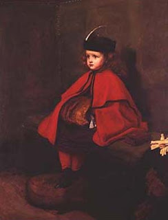
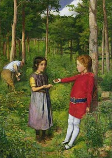
The Guildhall is totally ace. For one thing it is only £2.50 to get in which includes both the exhibition and the rather wonderful permanent collection AS WELL as arguably the best bit = the Roman amphitheatre in the basement!!! You therefore get three things for the price of one woohoo! Would highly recommend a visit to the amphitheatre alone if for nothing other than the funny illuminated green bums they have all over the place to symbolise athletes and gladiators etc. It’s hilarious and truly 80s. The poor bastards didn’t realise it was there until they started building the gallery and had to stop for about 20 years until it was properly excavated– must have been TRES annoying for them! The permanent collection is fab fab fab as they have some really wonderful Victoriana in there including My First Sermon and My Second Sermon by Millais and the CRAZY Woodman’s Daughter by the same artist:
They also have the amazing Israel in Egypt by Poynter which my old tutor Caroline Arscott wrote a very cool essay on all about muscular Christianity if I remember rightly: (check out the hot bods in this):


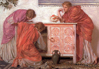
She also did a very strange class once which discussed the below Moore painting called Pomegranates in-terms of swirling vortexes of times (???):

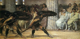
They also have this rather fabulous early Holman Hunt, who is one of my favourite’s, and some really beautiful Alma-Tadema’s to name but a few:
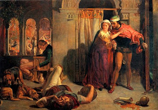


Last and by no means least is the very weird statue they have of Margaret Thatcher shoved into a corner upstairs, scary:

So, that’s the rather fabulous permanent collection, now onto the exhibition. I have been to see a couple of really rather fabulous shows at the Guildhall in the past, most notably the Watts (more on him later) last year. I have to admit, however, that whilst very enjoyable the exhibition now on is somewhat… well, odd, frankly. Empire Mail: George V and the GPO, according to the website, looks at the passions of King George V, the 'philatelist king', alongside an extraordinary period of design and innovation in the General Post Office during his reign. Basically the point of the exhib was showing how the social and political history of this period is demonstrated through stamps and the development of the post service. So yeah pretty fucking random I think you’ll agree. Cool though, in an ‘I can’t quite believe I’m here but enjoying this anyway’ type of way.

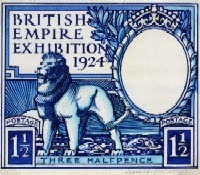
So, George V came into power on the anniversary of the penny black – i.e. the first stamp. He was an avid stamp collector collecting stamps specifically from Britain and the Commonwealth and his collection is now seen as one of the very best in the world containing several unique examples, or whatever. It belongs to the queen still who leant it to the Guildhall for this exhibition, how nice. For a stamp exhibition thankfully there seemed to be much fewer stamps on show than you would expect – which is definitely something of a relief. They had some of the rarer examples up including penny blacks, rejected designs for penny blacks, and things like the first stamp from elsewhere in the British Empire i.e. Mauritius. They also had designs for the first commemorative stamps which were for the British Empire Exhibition in 1924 (image at the top of this blog). Embarrassingly I had basically never heard of this one – The Great Exhibition yes and the Festival of Britain yes but nothing in between oops! The British Pavilion was turned into Wembley stadium though so there you go. Apparently the post office had it’s own pavilion along with a special mail service within the arena it was all considered to be so so important.

The rest of the exhibition was rather more interesting than all these stamps with lots of rather amazing blown up photographs of various things. One room was all about the postal service during the First World War and how important it was for the troops etc. They also had info about the Post Office Rifles which was a battalion made up entirely of postman and people who worked for the post office. Employees were actively encouraged to sign up and get their brains blown out – it was so popular in the 1st world war that they had to create a new division, or whatever military word you would use for this. They also had a section about the Suffragettes who had a big old relationship with the post office I knew nothing about, apparently seeing it as “both a means of mass communication and a symbol of the oppressive male Government; as friend and simultaneously foe”. They often vandalised post offices and poured tar, treacle or acid into post boxes as well as attempting to mail themselves to 10 Downing Street at one point as human parcels for the attention of the PM.

Appropriately, given the theme of the exhibition, George V was responsible for the worlds first scheduled air mail flight as part of the celebrations for his Coronation in 1911. A flight was arranged between Windsor and Hendon and postcards which could be sent on this new revolutionary post service were distributed in the local Windsor paper. This, alas, only happened once and it wasn’t until 1919 (ish) that it properly started. I guess air travel was still unbelievably expensive at this point, even for the mail. They also had an example of old school post boxes specifically for airmail which were a regular site in every town in the country until they changed the way it was collected, or something.


The exhibition then moved onto slightly more aesthetically pleasing ground and we had lots of lovely examples of 1930s poster art. This was due to the appointment in 1933 of Sir Stephen Tallents as the first Public Relations Officer for the Post Office. He set about a pretty impressive advertising and PR campaign and also started a competition to design a logo, apparently an early example of branding. He commissioned some of the best artists of the day to create beautiful posters such as the below:

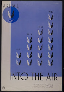
Kenneth Clark of the National Gallery, amongst other luminaries, was part of the selection committee for these, he was also on the committee that judged the entries in the competition to design the official stamp for the British Exhibition in 1924. Artists who were invited to contribute to that competition included Edward Dulac, one of my all time favourite illustrators!

Below is a poster by Vanessa Bell designed to encourage people not to leave their posting until the end of the day to save crowding, unfortunately it was felt to give the wrong type of message and was rejected!

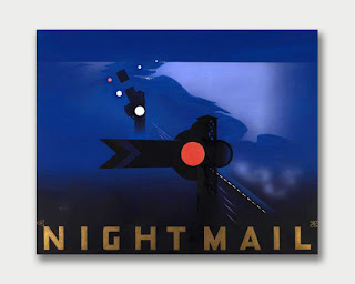
Tallents was also responsible for setting up the GPO film unit who produced numerous films advertising the postal service, some of which were specifically for educational purposes in schools and churches but they also produced news reels and perhaps most importantly the film Night Train which had a general cinema release.
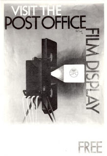
This hugely popular film celebrated the overnight postal trains which were used to both transport the post and sort it on the go. This film is thought to be responsible for putting British documentary making on the map and was hugely successful. W H Audin’s famous poem Night Train was based on the film and below is a link to the poem in case you would like to read it again!:

http://www.tynelives.org.uk/stephenson/poem.htm

For all those who enjoy poems about trains here is another FABULOUS one which was a favourite of mine as a kid – read it it’s really good!!:
http://www.poemhunter.com/poem/from-a-railway-carriage/

They also had a very beautifully illustrated/printed version of Audin’s poem on show which alas I can’t find online. A hugely popular poster was also produced around this time to advertise the night train service. Bastard Guildhall refused to make this into a postcard and instead I had to buy it as a greetings card which cost me more than the entrance fee to the exhib annoyingly:
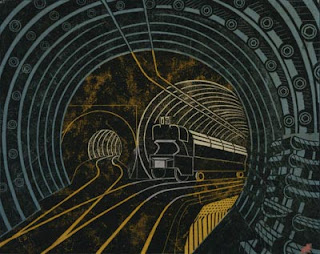
There was some other groovy stuff on show such as the first postal vans from the 30s and the first delivery motorcycles which were both very shiny, sort of thing men who collect stamps would very much enjoy. There was also some cool info about the London underground mail railway which I have always found very mysterious, romantic and exciting:

So, it was a very enjoyable if very random experience but in general go to the Guildhall as it’s great and always empty!

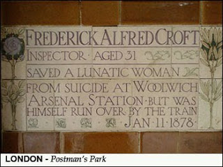
After we had left Sam took me to see a very strange monument that I can’t believe I had not known about before. If any of you have seen the beyond awful film Closer you will recognise it as being in the park Jude Law and Natalie Portman meet in at the beginning and if I remember rightly the end of the movie. For some, highly coincidental reason it’s called Postman’s Park and it contains the weirdest thing I have seen in a while. Conceived by the fabulous Victorian artist Watts it’s intended as a monument to people who sacrificed themselves to save others in every day life. This is intended to inspire us all to be more heroic and get killed trying to save other people. It’s a series of painted tiles, probably about 30 or so, along this random bit of wall and each is dedicated to one of these ‘everyday heroes’. Most of them seem to have drowned saving unfortunate people, or people more fortunate than them it turns out, some of them burnt to death, a few fell into wells or in front of trains. Seriously morbid stuff – high, HIGH Victorianarama. Love it! My favourite has to be to the man who died of exhaustion having saved people from the ice on Highgate Ponds, one of my favourite spots in London, the one below is also pretty good:
That’s all folks!

Tuesday, 15 June 2010

Week 21: Christen Købke; Danish Master of Light/National Gallery


Good afternoon fellow cultural pursuers. I am running slightly behind with my blog this week once again due to excess amounts of work and continuing mental and physical recovery from vile and savage stomach bug which lasted ALL LAST WEEK. Having been imprisoned in my flat feeling like death for 6 days straight I am pretty impressed that I managed to do anything cultural this week at all let alone 2 things which is in fact what I achieved. I managed to pack a weeks worth of activities into one Sunday and attended TWO exhibitions and went to see a film yay me. On a side note you know something is seriously wrong with the world if you can see 2 different shows with pieces collated from across history and the globe for free then pay £15 to see Prince of Persia – WTF??? Was v entertaining though highly recommend it although not bloody Gemma Arterton or whatever she’s called who although very pretty with a healthy body image can’t act for shit.

Anyway, TWO exhibitions you say? Yes indeed-y. However, don’t fear I have decided to write about the first one only as I was slightly art saturated for the second – Indian Portraits 1560 – 1860 at the National Portrait Gallery – and definitely couldn’t do it justice. This is a real shame actually as it finishes in 5 days and was really rather wonderful – and free! – so recommend it to you all especially if you happened to see and enjoy (as much as I did) the Gardens of the Cosmos exhibition at the British Museum last year.

So, instead I will regale you all with tales of the now closed exhibition; Christen Købke; Danish Master of Light at the National Gallery. This was one of those admission free 2 room exhibitions they do which are about the perfect possible length for any exhibition – 30 mins, a trip to the shop and then you’re done – ideal. I attended with my fellow ex-courtauldian Nat who was similarly feeling his way blinkingly back into the light like me only his return to the real world was from a 2 month self inflicted architecture part 2 retreat. Poor boy. My previous weeks pursuit was accompanied by his lovely fiancé Emily so it was clearly the natural progression to go to this one with him. We both enjoyed it mightily.

Now, as usual I hadn’t really heard of Christen Købke before although was familiar with some of his rather beautiful paintings from elsewhere, although where exactly I am not sure worryingly. Here is a brief history of the man paraphrased from Wikipedia:

Christen Schiellerup Købke (1810 –1848), was one of the best known artists belonging to the Golden Age of Danish Painting. Købke, a national romantic, painted portraits, landscapes and architectural paintings. Most of his portraits show friends, family members and fellow artists and found most of his motifs in his immediate surroundings and produced work renounced for their harmonious use of composition and colour. Almost forgotten in his own lifetime despite praise of various contemporaries, Købke had never been inundated with commissions yet is recognized today as one of the most talented among Denmark’s Golden Age painters and the most internationally renowned Danish painter of his generation.

So bit bad that I hadn’t heard of him but fuck it I haven’t heard of anyone – that £75 Student loan repayment coming out of my pay check each month really is a cruel mockery. However, I do know a small amount about some of his contemporaries such as Caspar David Frederick – who I LOVE - and others, and can definitely make up a lot of almost plausible sounding shit from that which I will now proceed to do. I will also supplement this heavily with untrustworthy internet sources.

The Golden Age of Danish painting refers to the first half of the 19th century which if I remember anything would encompass both Romanticism and Realism – I think, both of which are ace. Købke’s work seems to tick both these boxes in various ways. He militantly studied and sketched from the real world taking highly detailed preliminary studies for his pieces which he transferred directly to the surface of the canvas. This was dictated by his tutor the great Christoffer Wilhelm Eckersberg who was enormously influential to both Købke and his contemporaries. Despite travelling to Italy on scholarships from the Danish Academy his subject matter also tends to focus on the mundane and everyday surroundings of his home – a citadel just outside Copenhagen, and his canvases are populated with figures from every day life; cigar sellers, milkmaids and small boys throwing stones to name but a few.


This idealised version of reality is sort of like the Danish version of official, salon-friendly French Realism such as the work of Jules Breton who created images of idealised peasant life, unchanging and unthreatening, satisfying the contemporary taste for images of ‘real life’ peasantry without the controversy of artists such as Courbet:


Contemporary accounts suggest life at a citadel was rough and seedy but this doesn’t come through at all in Købkes work which instead makes his ‘home town’ seem tranquil and harmonious, half deserted in a sleepy happy sort of way. We are presented with the perfect image of provincial Danish life, simple and balanced and unchanging and thus it’s easy to see why his work was considered to be national romanticism – imbuing the everyday with the noble and spiritual.


The image above and the one below demonstrate his use of highly emotive colour which he used to create an idealised version of the natural world which is much more in tune with Romantic ideals. The concept of the emotive, intellectual landscape was a highly Romantic concept – the idea of nature as sublime, a harbinger of both tranquil beauty and raw emotion is half articulated in works such as this which use a palate of pinks and purples to suggest evening light. The painting below; View of Dosseringen near the Sortedam Lake Looking towards Norrebro demonstrates this. The painting seems ambiguous – is this boat returning or departing, what is the relationship of the women
waiting on the quay and what is the significance of the Danish flag etc etc?. The pink water lends it a sense of the unreal; dreamlike and contemplative. We feel like this is a wistful image, the landscape subdued, reflective and thoughtful – a Romantic landscape.

It is really with his portraits that Købkes work seems to be more ‘Realist’. He tended to paint friends and family more than anything else, mainly because he didn’t receive many commissions. Instead we get images such as this of his own mother, a decidedly un-idealised image of a busy slightly careworn house wife (and apparently mother of 11!)


He also did a series of ‘character portraits’, which alas like usual I can’t find images of, which are rather beautiful and show the wrinkles, frowns and general un-idealised reality of everyday people. There is this fabulous one of a baker with pretzels and a cigarillo with most of the buttons in his flies undone hhahahaha – Købke grew up on the citadel because his father was master baker so there is a real sense of the familiar and affectionate in this pic:

As well as these he did several portraits of fellow artists such as this fabulous one of Frederik Sødring with whom he shared a studio – love love love this pic it’s totally fab sexy and informal and I love the way you can see their different artistic stimulus and inspiration in the fragments stuck to the wall behind him such as prints or sketches of cows – very Danish. Doesn’t he have a nice face!?
Last but by no means least the exhibition had a fabulous array of his architectural pieces – especially those based on Frederiksborg Castle which he painted numerous times from various, increasingly daring viewpoints.

The castle was a national landmark and was being rediscovered at this time by writers and artists as a relic of Denmark's glorious history. Here Købke really excelled in his depiction of light, space and a sense of endless flat Danish landscape dominated by sky – empty and epic. Here he shows an ability to use daring angles which turn the monumental castle into abstract shapes and planes of view. So minimal, classy and fabulous wish to own one of them BADLY!! And on that note I sign out for another week – stay classy San Diego.

Monday, 7 June 2010

Week 20: Exposed; Voyeurism, Surveillance and the Camera/Tate Modern


Dear all

So should be doing work but back on track with the one a weeks for once woohoo. This week thanks to the lovely Emily I was organised enough to do something cultural on Friday evening after work which was very civilised indeed (for me) and meant that for once I didn’t have a mad rush on Sunday afternoon to find something close, cheap and not too intense to do on a hangover! Instead we went to the Tate Modern with the other cultural people who think to go to late opening and we even had drinks and olives on the terrace of the members bar yippee. One day I really must join the Tate rather than just using everyone else’s membership as the bar is almost worth the price of the annual ticket alone, well almost.

The exhibition we went to see was Exposed; Voyeurism, Surveillance and the Camera and it’s on til October if any of you want to see it. I had the joy (for me) of approaching this exhibition without a clue what it was about which is always fun. In fact, I didn’t event know what exhibition we were going to see until just before and haven’t been keeping in touch with what is currently on at the Tate, or anywhere, so this was all a total surprise for me which I think always adds somewhat to the ‘gallery experience’. Interestingly enough Emily is a fellow blogger and I imagine will be writing about this too so it’s almost as if we are voyeur-ing each other!! Am sure she will have much more interesting things to say – I will stick to a quick over view as haven’t got enough time to think of anything intelligent or thought provoking to say!!!

Now, let me preface with a slight, or massive actually, prejudice I have against photography exhibitions. Basically, I firmly believe that any bloody photograph when blown up and put in a nice frame (or preferably a light box) on a white gallery wall looks impressive. Any shit snap-shot I could take from this weekends barbecue would suddenly look a hell of a lot more impressive, meaningful and thoughtful if I paid to have it reproduced nicely and put in a museum space. This is why I am usually not that interested in photography exhibtions – because any moron can aim a camera at something and produce a half good image. Let’s not forget that photography was invented by a frustrated artist. This sounds like a massive diss, which it is, I just don’t think photographers are as talented as any other ‘artist’. Sorry!! However, that doesn’t mean I can’t enjoy mightily a photography exhibition – especially ones with old-school images in like this.

So, this is what they have to say for themselves on the website:

“The UK is now the most surveyed country in the world. We have an obsession with voyeurism, privacy laws, freedom of media, and surveillance – images captured and relayed on camera phones, YouTube or reality TV.”

This may be a slightly obvious theme but I found it interesting none the less. I find everyone’s hatred of surveillance in this country deeply irritating because they complain and complain and complain about it yet when someone gets mugged/kidnapped/murdered or whatever it’s suddenly the best thing in the world and people just cant understand why that dark alley behind the back of Tesco wasn’t properly filmed – you can’t have it both ways idiots its either a nanny state with the benefits or not. I find it quite comforting to know that I am photographed every 20 seconds or whatever it is – at least if someone tried to kidnap me the police would know my movements and frankly I have been caught doing a fair amount of naughty things on CCTV and never been arrested etc so all good really. I did have an ongoing fantasy about throwing a brick through the window of my ex boyfriends brothers bedroom for a long time which was only stopped by the fact that they lived on a main road with loads of cameras up and down it – but that can only be a good thing surely???

So, the exhibition charted the use of photography as a ‘weapon’ of surveillance, control, knowledge, etc. They began in chronological sequence (sort of – if you ignore some of the REALLY awful pieces in the first room – a collection of ugly people photographed unawares in front of blacked out backgrounds – yeah great shakes rah rah rah). So, we had some nice pics from Walker Evans's Subway Passengers series which seem to get trotted out at almost any photography retrospective like, ever, but I haven’t got any problem with that as they are quite good.


They also had some really cool examples of hidden or trick cameras which were really fascinating – cameras hidden in the heals of shoes or the top of walking sticks etc. Clearly the covert observational aspect of photography was realised pretty early on – most of these examples were from the 1890s/1900. The photographer Paul Strand used a special camera with a false lens at the front and a real one at the side to capture the poverty stricken of New York while off guard – which is mean; if you haven’t washed for 2 weeks it would be nice if someone asked your permission to preserve you in celluloid history for 100 years:


There seemed to be a hell of a lot of focus, especially at this point in the exhibition, on New York which I found interesting, I don’t really know why that was though!!

This was the part of this exhibition I personally found most interesting as, at this point, photography was relatively new still and it provided a totally revolutionary way of seeing the world – which I find interesting. Before this, if you think about it, EVERY image was highly curated in one way or another. This is the first time people were viewed unawares, out of their own control and in a spontaneous light. In short a totally different way of viewing people and the world. Somehow though these images are never viewed or discussed in terms of their intense smugness. I understand the photographers desire to shine a lens on the worlds inequalities and destitution, but to do so without the subjects permission almost feels as if it is the ethnographic, racist eye of the colonial conqueror – viewing these people as specimens from a different world who don’t have the right to control their own image, identity or voice. This is why I quite like the below work by Lee Friedlander for both it’s sinister appearance and focus on the more day-to day middle class domestic space – a preened modern women walking the streets of New York ‘alone’ rather than the destitute masses lining up for work. Again though – if this was in your photo album in colour rather than back or white you’d probably think it was bollocks.


The next couple of rooms dwelt on something I will forever find fascinating – the cult of celebrity and in this case how paparazzi, and non paparazzi photography helped to feed this. There was an AMAZING one of Degas coming out of a public toilet in the 1880s by Giuseppe Primoli hahahahahaha!!: They had some pieces by the photographer Ron Galella who obsessively followed and photographed Jackie Onassis until she got a restraining order against him, the birth of the modern concept of celebrity hand in hand with the modern concept of ‘talent’ ego – although you do have to feel sorry for her she was the first of many! I could go on about paparazzi and celebrity for days I really could but don’t worry I wont I realise no one is as interested in this as me!

There were several rooms about sex and voyeurism etc but to be honest I found this the most disappointing part of the exhibition – this is just too big a subject to fit into 2 rooms, it needed a whole separate exhibition to do it justice and I really can’t be bothered to go into this at all which in fairness is because I am lazy and have actually got to do other things today. I did find it amusing that all the little rooms where they screen films were empty apart from the one coming off this room which had a sign saying ‘over 18s only this film has extreme sexual content’, or something, and it was absolutely packed!! I couldn’t even get in there but I am pretty sure it was that series by Nan Golding to which I can only really say SNOAR. I found those images quite touching and interesting until the age of about 21 when I realised they were pointless and empty and she is beyond self involved – it’s just not funny. Maybe if my boyfriend beat me up and all my friends died of aids people would want to see my photos too but I hope to god I don’t find out. There were some great pics taken inside cinemas with people snogging which were great though:


For me one of the more interesting sections of the exhibition was that entitled Witnessing Violence about images which we as viewers feel that we should not really be witnessing, scenes that are too personal or that we are intruding on as outside spectators. This includes war photography as well as more personal stories such as a really harrowing series of images of potential suicide victims, crowds on the street below watching in morbid fascination to see them jump. There was a HORRIBLE set of 2 which unfortunately I can’t find images for with a man about to jump from the 8th floor of some building in Johannesburg, or somewhere. There are 2 shots – one of him looking back to camera from his perch absolutely terrified with mad eyes and the other of him jumping. Apparently crowds below were shouting ‘jump jump jump’ as someone was trying to talk him down – fucking chilling. Anyway I have to do some work but definitely a worthwhile exhibition to see! See ya later bitches x